When I first started experimenting with color and texture in interior design, I was amazed at how much they transformed the feel of a space. A room that once felt flat and uninspiring suddenly became warm, balanced, and full of character. Whether you are styling your first apartment or refreshing a long-loved family home, learning how to use color and texture is one of the most powerful tools in design.
In this ultimate guide, I’ll walk you through the psychology of color, how to choose the right paint shades, ways to layer textures for depth, and practical tips for combining patterns. You’ll also discover how accent colors, neutrals, and natural materials can shape the mood of each room. My goal is to give you both inspiration and actionable steps so that your home feels stylish, comfortable, and uniquely yours.
The Psychology of Color in Interior Design
One of the most fascinating aspects of design is how colors influence our emotions and behavior. The psychology of color in interior design has been studied for decades, and research consistently shows that certain shades can affect mood, energy, and even productivity.
For example:
- Blue often creates a calming and serene environment, which is why it works beautifully in bedrooms and bathrooms.
- Yellow is linked to optimism and energy, making it ideal for kitchens or creative spaces.
- Green symbolizes balance and renewal, a great choice for living rooms or areas where relaxation is key.
- Red adds drama and passion but is best used sparingly to avoid overwhelming a room.
When I first learned about color psychology, I realized why my old living room painted in a muted gray felt cold and lifeless. By introducing warm earth tones and soft textures, I instantly shifted the atmosphere into something inviting and restorative.
If you’d like to dive deeper into the science behind color and mood, the American Psychological Association offers insights into how colors shape our perceptions in daily life. Applying this knowledge allows you to design not just for style, but also for how you want to feel in your home.
Choosing the Right Paint Colors for Your Home
Selecting paint colors can feel overwhelming, but it becomes much easier when you think about the role each shade plays in your overall design. The right choice balances personality, function, and atmosphere.
Decorating with Neutrals for Balance
Neutrals are often considered the foundation of interior design. Shades like beige, ivory, taupe, and gray create a calming backdrop that allows furniture, artwork, and textures to shine. Decorating with neutrals does not mean settling for boring. By mixing warm and cool undertones, you can achieve very different effects:
- Warm neutrals (like creamy beige or greige) bring comfort and coziness, perfect for living rooms and bedrooms.
- Cool neutrals (like soft gray or stone) feel sleek and modern, ideal for minimalist or contemporary spaces.
When I redecorated my dining area, I chose a warm neutral for the walls and paired it with a textured linen table runner. The combination created a space that felt sophisticated yet inviting, and it quickly became the heart of family gatherings.
For further inspiration on working with neutrals, Architectural Digest showcases timeless examples of how designers use them as a base for layered interiors.
Accent Colors in Interior Design
Accent colors are where personality comes alive. They provide contrast, highlight focal points, and create visual interest without overpowering the room. Accent colors can be introduced through:
- A single painted wall
- Throw pillows or textiles
- Artwork and decorative accessories
- Statement furniture pieces
The key is balance. Too many accents in competing shades can make a room feel chaotic. Instead, choose one dominant accent color and echo it in small doses throughout the space. For example, a navy-blue accent wall can be complemented by a patterned rug with subtle blue tones, or a mustard-yellow chair can be balanced with artwork featuring hints of gold.
I’ve personally found that accent colors are a great way to refresh a room without repainting everything. A few strategic updates in textiles or accessories often make the whole space feel new.
Bold and Moody Colors
While neutrals and accents provide balance, bold colors bring drama. Deep jewel tones like emerald green or sapphire blue create a luxurious atmosphere, while moody shades of charcoal or burgundy can make a room feel intimate. The trick is moderation — use bolds in rooms where you want impact, and pair them with textures to avoid flatness.
When I experimented with a moody navy in my bedroom, I softened the look with natural wood furniture and plush velvet bedding. The result was both dramatic and restful.
The Role of Texture in Interior Design
If color sets the mood of a room, texture gives it life. Texture refers to how surfaces look and feel – smooth, rough, soft, or glossy – and it’s one of the most underrated elements in creating a dynamic, inviting space. Without texture, even the most well-chosen color palette can fall flat.
Layering Textures for Depth
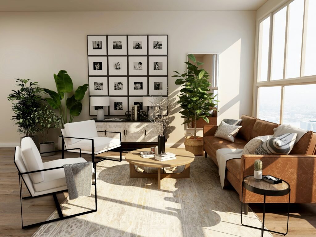
Layering textures is one of the simplest ways to make a room feel complete. Imagine a living room with a sleek leather sofa. On its own, the leather can feel cold. Add a chunky knit throw, a woven jute rug, and linen curtains, and suddenly the space feels warm and multidimensional.
I’ve personally used layering to transform my own spaces. In a minimalist home office, I introduced a wool rug and rattan side chair, instantly breaking up the monotony of flat surfaces and making the room feel more creative and inspiring.
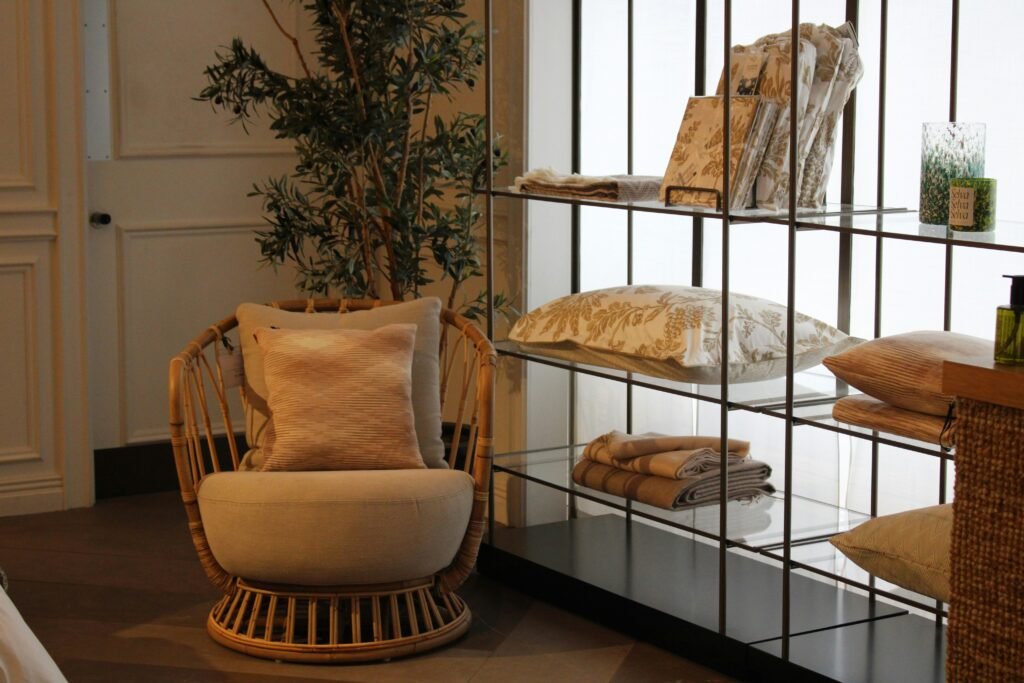
Natural Textures: Rattan, Linen, and Jute
Natural textures are timeless and versatile. Materials like rattan, linen, jute, and wood bring an organic feel that grounds a room. They connect us to nature and create balance against sleek modern finishes.
- Rattan is lightweight yet durable, making it perfect for accent chairs, baskets, or light fixtures.
- Linen has a relaxed, breathable look that works beautifully for curtains, tablecloths, or bedding.
- Jute rugs add earthy texture underfoot and complement almost any color palette.
Designers often combine these materials with soft furnishings to achieve harmony between rustic and refined. For inspiration, Elle Decor highlights how natural textures are being integrated into both contemporary and traditional interiors.
Texture Contrast for Visual Interest
Contrast is key. Pairing smooth and rough textures creates balance and prevents monotony. For example, polished marble countertops in a kitchen look stunning next to rough wooden beams, or a sleek glass coffee table pops against a plush shag rug.
When mixing textures, I always ask myself: Does the room feel flat or does it invite me to touch and explore? If the answer is the former, I know it’s time to bring in contrasting materials.
Mixing Patterns and Textures in Home Decor
Patterns work hand in hand with texture. Stripes, florals, and geometric prints can energize a space, but they need grounding with solid colors and tactile materials. The trick is to combine patterns in varying scales like a bold stripe with a small floral so they don’t compete.
A personal favorite experiment of mine was pairing a striped navy cushion with a subtle geometric rug and a floral throw. At first, I worried it would clash, but by sticking to a consistent color palette, the patterns felt cohesive instead of chaotic.
Color and Texture by Room
Every room in your home serves a different purpose, which means the way you apply color and texture should adapt to the function and mood of that space. Here’s how to approach some of the most important rooms.
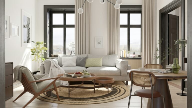
Living Rooms
The living room is often the heart of the home, where relaxation meets social gatherings. A balanced palette of neutrals with carefully chosen accent colors creates a versatile backdrop for both everyday comfort and entertaining.
Textures make all the difference here. A smooth leather sofa paired with a soft wool throw, or a sleek coffee table balanced with a woven rug, adds layers of interest. This is also the perfect space to experiment with patterns – think geometric pillows mixed with organic, flowing curtains.
When I updated my living room, I used earth-tone walls to anchor the space and introduced bursts of mustard and navy through cushions and artwork. The result felt grounded yet full of energy.
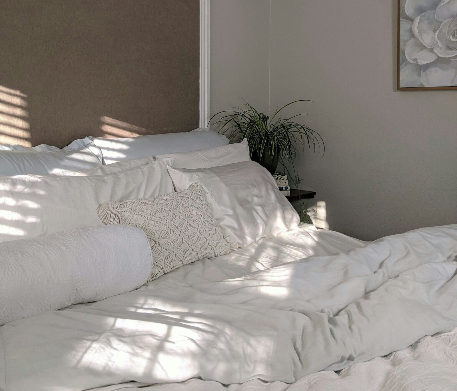
Bedrooms
Bedrooms benefit from calming shades and tactile materials. Soft blues, muted greens, and warm neutrals promote relaxation, while luxurious textures like velvet headboards, linen bedding, and plush rugs add comfort.
For a cozy yet stylish look, try layering textures: start with cotton sheets, add a quilted blanket, and finish with a chunky knit throw at the foot of the bed. The contrast in materials creates visual depth without overwhelming the restful vibe.
Kitchens and Dining Rooms
In kitchens and dining rooms, color and texture work together to create warmth and functionality. White or neutral walls offer a timeless backdrop, while accents like navy cabinetry or a colorful backsplash inject personality.
Textures should be both practical and stylish – wooden dining tables, ceramic tiles, and stone countertops bring natural character. Adding linen napkins or woven placemats softens the harder surfaces and makes the dining experience more inviting.
I once added a bold emerald-green accent wall in my dining room, paired with natural oak furniture and linen curtains. It became the perfect balance of drama and comfort.
Small Spaces
Small rooms benefit from strategic use of both color and texture. Light colors can make a space feel larger, while mirrors enhance natural light. But adding texture prevents these spaces from feeling sterile.
A compact home office, for example, can be elevated with a woven jute rug under the desk, floating wooden shelves, and a pop of color on one accent wall. These touches create interest without overwhelming limited square footage.
How Lighting Affects Color and Texture in a Room
Lighting can completely change the way we perceive both color and texture in interior design. A shade that looks perfect in the store may appear entirely different once it’s on your walls at home. That’s because natural and artificial light affect color tones, brightness, and even how textures appear.
Natural Light vs Artificial Light
- Natural light tends to bring out the truest version of a color. North-facing rooms often feel cooler and benefit from warm hues, while south-facing rooms are flooded with warm light and can handle cooler tones.
- Artificial light can alter colors significantly depending on the bulb. Warm bulbs enhance reds and yellows, while cool bulbs highlight blues and grays.
I once painted a hallway a pale sage green that looked fresh in daylight but appeared dull and grayish under artificial light at night. The fix? Switching to warmer LED bulbs, which restored the inviting feel I was aiming for.
How Lighting Influences Texture
Textures are also transformed by lighting. A rough brick wall looks dramatic under angled lighting because shadows highlight its depth, while a glossy surface reflects more light, making the space feel brighter and more open. This is why textured finishes often need thoughtful lighting to look their best.
Testing Samples Before Committing
One of the most practical steps you can take is to test samples before committing to a full room. Here’s a quick guide:
- Paint or apply swatches on multiple walls of the room, not just one.
- Check them at different times of day, morning, afternoon, and evening to see how they react to shifting light.
- Observe under artificial lighting with the bulbs you plan to use.
- Pair with textures – hold fabric samples or flooring next to the color to see how they interact.
This simple testing process can save both time and money while ensuring you achieve the exact look you want.
For deeper insights, Benjamin Moore offers professional guidance on how lighting conditions alter paint colors, which I’ve found incredibly useful when planning client projects.
2025 Color and Texture Trends
Each year brings fresh perspectives on how color and texture shape our homes. In 2025, the design world is leaning into palettes and finishes that balance comfort, sustainability, and bold self-expression.
Pantone’s Color of the Year
Pantone’s annual Color of the Year always sets the tone for interiors. While the chosen shade may change from year to year, it consistently influences everything from paint colors to textiles and furniture. Designers use it as a starting point to inject freshness into otherwise timeless schemes.
For example, a vibrant Pantone hue might inspire accent pillows, a statement chair, or even a bold front door. Personally, I find incorporating the Color of the Year works best in small doses. It keeps a room on-trend without requiring a total overhaul when styles shift again.
You can see how Pantone positions its choices globally on the official Pantone Color Institute website.
Seasonal Color Palettes
Beyond Pantone, seasonal palettes continue to inspire homeowners:
- Spring: Soft pastels paired with light natural textures like linen or cotton.
- Summer: Bright, sun-washed tones combined with airy finishes such as wicker and rattan.
- Fall: Earthy shades — terracotta, ochre, forest green — grounded with heavier fabrics like wool or velvet.
- Winter: Moody hues like navy, charcoal, and burgundy balanced with metallic accents and soft throws.
I’ve often found that rotating accessories seasonally like swapping pillow covers or table runners is one of the most affordable ways to embrace changing palettes without repainting.
Minimalist vs Maximalist Textures
Texture trends in 2025 continue to fall into two camps:
- Minimalist textures emphasize clean lines and subtle finishes, think matte walls, smooth stone, and fine linen. They appeal to those who prefer calm, uncluttered spaces.
- Maximalist textures lean into bold layers like patterned wallpapers, plush upholstery, and highly tactile surfaces. These are perfect for homeowners who love rich, dramatic interiors.
What excites me most is that design today celebrates personal preference. You don’t have to choose one style exclusivel. Blending minimalist bases with a few maximalist accents can create a home that feels both modern and full of character.
Budget Friendly Ways to Add Color and Texture to Your Home
Creating a stylish home doesn’t have to mean expensive renovations or designer furniture. In fact, some of the most impactful updates I’ve made were also the most affordable. By focusing on small but thoughtful changes, you can transform the look and feel of any room without overspending.
Easy DIY Updates
- Paint a Feature Wall
A single accent wall in a bold color can redefine a space. It’s low-cost, quick, and instantly eye-catching. - Update Soft Furnishings
Swap out cushion covers, curtains, or throws. Textiles are one of the easiest ways to introduce both new colors and fresh textures. - Experiment with Removable Wallpaper
Peel-and-stick wallpaper has become a game-changer. It lets you try patterns and textures without long-term commitment. Perfect for renters or design experiments. - Use Area Rugs for Zoning
Rugs not only add texture but also help define zones in open-plan living areas. Layering smaller rugs is another affordable way to create visual interest. - Bring in Nature
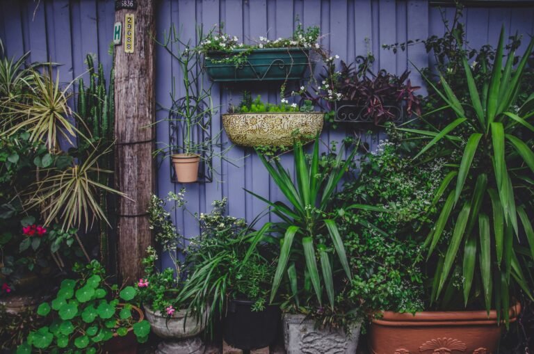
Plants are a cost-effective way to add both color and texture. Their greenery enlivens any neutral palette, while pots in terracotta, wicker, or ceramic introduce tactile variety.
Creative Low Cost Hacks
- Repurpose Furniture: Sanding and repainting old furniture gives it a second life. I once turned a dated dresser into a statement piece with a coat of deep navy paint and new brass handles.
- Textured Accessories: Baskets, woven trays, and linen table runners add warmth without breaking the bank.
- DIY Art: Creating your own wall art in complementary colors adds personality and texture while saving money.
Small Changes, Big Impact
What I’ve learned over the years is that you don’t need to redo everything at once. Focus on one or two changes per room like a new set of curtains, a bold paint shade, or a textured rug and you’ll notice how the entire space feels refreshed.
If you’re looking for even more affordable inspiration, HGTV regularly shares budget-friendly decorating ideas that are both practical and stylish.
Conclusion
Mastering color and texture in interior design is about more than just choosing pretty shades or fabrics, it’s about creating a home that reflects who you are and how you want to feel every day. From the psychology of color to layering textures and mixing patterns, these elements work together to shape spaces that are both functional and beautiful.
When I look back on my own design journey, the biggest transformations didn’t come from expensive renovations, but from thoughtful decisions about color palettes, accent pieces, and textural details. A single paint change, the addition of a natural jute rug, or a well-placed accent wall often made my rooms feel completely new.
As you start applying these ideas, remember: there are no strict rules, only guidelines. Your home should feel like your sanctuary, whether that means soft neutrals with linen curtains or bold jewel tones paired with velvet cushions. By experimenting and layering thoughtfully, you’ll discover a style that feels timeless yet deeply personal.
Color and texture in interior design aren’t just finishing touches, they are the foundation of every inviting, inspiring space.
Alex is the creator of Homely Haven, a space dedicated to simple, stylish ideas for interiors and gardens alike. With a passion for cozy living rooms, inviting outdoor spaces, and practical DIY solutions, Alex shares tips and guides that help turn any house into a true home.
From budget-friendly decorating hacks to weekend garden projects, the goal is always the same: to inspire you to create spaces that feel personal, beautiful, and welcoming. When not writing, Alex is usually rearranging furniture, sketching new garden layouts, or exploring design trends for the next project.