Choosing the right paint color for your home is one of the most exciting and sometimes overwhelming parts of decorating. Color has the power to completely transform a space, set the mood, and reflect your personality. The shade you select will surround you daily, so it deserves careful thought and planning.
When I painted my first apartment, I made the classic mistake of picking a color in the store under fluorescent lighting and applying it without testing it at home. What looked like a soft, calming gray in the swatch turned into a chilly blue once it was on my walls. That experience taught me an invaluable lesson: the right color is about much more than what you see in the paint aisle.
In this guide, we’ll explore the key steps to help you confidently choose a signature shade that feels personal, timeless, and harmonious. From understanding undertones to testing samples in different lighting, I’ll walk you through both expert advice and practical insights I’ve learned firsthand.
Why Choosing the Right Paint Color Matters
When you choose paint color for your home, you’re making more than a decorative decision, you’re setting the mood, shaping how each room feels, and even influencing how people interact within the space. Color psychology shows that warm hues like yellows and reds can energize a room, while cooler tones such as blues and greens bring a calming effect. This is why designers often describe paint as the most powerful yet affordable design tool available.
According to This Old House, the right shade can make a small room feel larger, highlight architectural details, or tie together open-concept spaces. A carefully selected paint color for your home can also create a sense of continuity, making transitions between rooms feel intentional and polished.
Trends evolve, too. Architectural Digest recently highlighted how homeowners are embracing moodier tones and richer palettes to bring personality into their interiors. Still, timeless neutrals remain popular for their flexibility. As The Guardian points out, finding balance between trendy and classic shades helps you avoid repainting every few years.
From my own experience, I’ve learned that color doesn’t just live on the wall, it reflects how you want to feel in your home. Picking the wrong shade can leave a room feeling flat or uncomfortable, but the right one brings harmony and joy to your everyday life.
Starting with Inspiration and Your Decor
One of the best ways to choose paint color is to look closely at the pieces you already love in your home. Furniture, rugs, artwork, or even a favorite throw pillow can provide a ready-made palette that feels authentic and personal.
When I was redesigning my living room, I pulled inspiration from a vintage rug I’d bought years earlier. Its warm terracotta tones paired beautifully with muted greens, and those colors became the foundation for the entire room. By letting your décor guide you, you ensure that your walls won’t clash with what you already own.
Designers consistently recommend this approach. Martha Stewart suggests starting with a fabric swatch or artwork to create a cohesive scheme, while Refined Rooms highlights how an “inspiration piece” makes narrowing down color families much easier. Even everyday decorators agree: on Reddit, users often advise pulling wall colors from textiles and personal treasures.
Here are a few reliable inspiration sources to explore:
By starting with something meaningful, your final paint color for your home will feel like a reflection of your personal style rather than a random trend.
Understand Undertones and Light Reflectance Value (LRV)
Two of the most overlooked but critical factors when choosing a paint shade are paint undertones and Light Reflectance Value (LRV). These can completely change how a color looks once it’s on your walls.
Every paint color has an undertone, the subtle hue beneath the surface. A beige might lean pink, yellow, or green. A gray might shift blue or purple under certain light. If you ignore undertones, you may end up with walls that clash with your furniture or flooring. Kylie Interiors explains that testing undertones against white paper is a simple way to reveal hidden tints.
LRV, on the other hand, measures how much light a paint color reflects. Higher numbers mean the shade is lighter and reflects more light, while lower numbers mean it’s darker and absorbs light. As Martha Stewart notes, this helps you determine whether a color will brighten a space or make it feel cozier.
I’ve personally made the mistake of choosing what I thought was a “neutral” gray, only to discover it had a strong blue undertone that made my room feel cold. Now, I always test swatches on different walls and revisit them throughout the day. Homemade Lovely recommends this approach as well: look at samples morning, afternoon, and evening to see how natural and artificial light affect the shade.
Here’s a quick checklist to keep undertones and LRV in mind:
Getting familiar with undertones and LRV ensures the paint color for your home looks intentional, not accidental.
Factor in Lighting and Room Size
Even the most carefully chosen shade can look completely different once applied, because room lighting and paint are inseparable. Natural and artificial light dramatically affect how colors read in a space, and ignoring this factor is one of the most common mistakes homeowners make.
This Old House explains that north-facing rooms tend to make colors appear cooler, while south-facing spaces amplify warmth. East-facing rooms glow in the morning light but look duller by evening, whereas west-facing rooms shift from muted in the morning to glowing at sunset. This means a gray that looks balanced in a south-facing living room might feel icy in a north-facing bedroom.
Artificial lighting matters too. Sherwin-Williams notes that warm bulbs highlight yellow and red undertones, while cooler bulbs can emphasize blues and greens. Always test your paint in both day and night conditions to see its full personality.
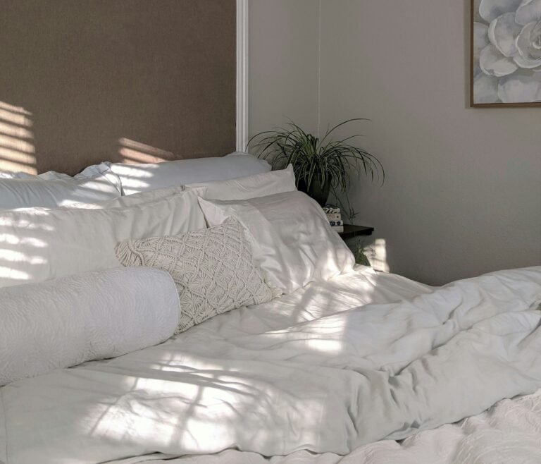
Room size plays a role as well. Light shades tend to expand small rooms, reflecting more light and giving a sense of openness. Darker hues absorb light, adding intimacy and coziness to large spaces. I’ve seen this firsthand in my own home: my small hallway instantly felt more spacious after I swapped a mid-tone taupe for a creamy off-white.
To get the best results, follow these steps:
When you factor in both lighting and scale, your paint color for your home will feel harmonious in every setting, not just under ideal conditions.
Test Samples and Narrow Down
No matter how confident you feel in the store, you should never commit to a color without testing a paint color sample at home. A small chip or digital preview simply can’t capture how a color will behave on your walls, under your lighting, and next to your furniture.
This Old House recommends painting large swatches directly on the wall or on foam boards you can move around the room. Observe them at different times of day and in both natural and artificial light. Over a few days, patterns will emerge, some shades will consistently feel “right,” while others may start to feel dull or jarring.
Testing samples also helps with whites and neutrals, which can be deceptively tricky. The Guardian notes that trying a range of cool, warm, and neutral whites side by side makes undertones much easier to spot.
You can even customize samples. Real Simple suggests asking your paint store to tweak a color formula like lightening or darkening by a percentage to fine-tune it. This trick is especially helpful if you love a shade but wish it were just a touch softer or bolder.
Personally, I like using peel-and-stick swatches from brands like Samplize. They’re large, removable, and let me move the color around the room to see how it looks against different finishes. Kylie Interiors recommends a similar method to reduce overwhelm when narrowing down options.
Here’s a simple process for narrowing your choices:
- Order or buy at least three paint color samples within your chosen palette.
- Apply large swatches on multiple walls (or use peel-and-stick alternatives).
- Observe in daylight, lamplight, and evening conditions.
- Compare against furnishings, flooring, and trim.
- Eliminate until you find the shade that feels consistently right.
This step requires patience, but it’s the surest way to avoid costly repaints and ensure the paint color for your home is one you’ll love long-term.
Consider Room Function and Flow
When you choose paint color for any room, it helps to think beyond aesthetics. The way you use the space, the mood you want to set, and how it connects with surrounding rooms all influence the best choice.
For example, bedrooms often benefit from soothing shades like soft blues or muted greens, which encourage rest and relaxation. Kitchens and dining areas, on the other hand, can handle more energy – sunny yellows or fresh greens add vibrancy and appetite appeal. Living rooms work well with versatile neutrals, since they often serve multiple purposes. The Decorologist emphasizes the importance of matching color psychology with function to ensure rooms “feel” right for their purpose.
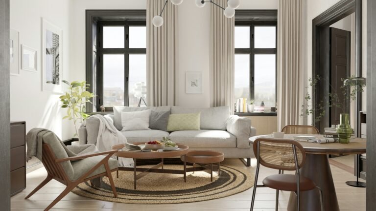
Flow is equally important. If your home has an open-concept design, abrupt changes in wall colors can feel jarring. Instead, choose a dominant palette that carries through, with accent shades defining specific areas. Sherwin-Williams recommends using a consistent trim or base color to create cohesion while experimenting with wall tones to add personality.
I’ve found this especially helpful in my own home. My living and dining rooms share a sightline, so I selected two complementary shades: a warm neutral in the living space and a deeper accent tone in the dining area. The colors differ, but because they belong to the same family, the transition feels intentional and seamless.
Here are a few tips for balancing function and flow:
- Match colors to the mood of the room (calm, energetic, cozy, formal).
- Use neutrals or consistent trim to tie adjacent rooms together.
- Save bold, contrasting colors for spaces you want to stand out, like powder rooms or feature walls.
- Think of your whole home as one connected palette rather than isolated rooms.
By considering both function and flow, you’ll create a paint color for your home that enhances daily living and looks beautifully coordinated throughout.
Use Do’s and Don’ts to Avoid Mistakes
Even with research and planning, it’s easy to misstep when you choose paint color. Following a few proven do’s and don’ts can save you from costly repaints and design regrets.
Do’s
- Do choose paint after furniture and key décor pieces. As Martha Stewart notes, it’s far easier to match walls to fabrics and furniture than the other way around.
- Do test large swatches in different lights. Homemade Lovely stresses avoiding reliance on tiny chips or store lighting.
- Do create complementary schemes. Jeff Schultz Painting recommends considering how your paint will interact with flooring, trim, and nearby rooms.
- Do think about your lifestyle. High-traffic areas may benefit from more durable, wipeable finishes in forgiving mid-tones.
Don’ts
- Don’t pick a color under fluorescent lights at the store. It almost never looks the same at home.
- Don’t ignore undertones or LRV. As we covered earlier, these hidden qualities can make or break your choice.
- Don’t forget room size and light exposure. Parade of Homes warns that skipping this step often leads to rooms feeling darker or smaller than intended.
- Don’t rush the process. Living with samples for several days gives you the clearest picture.
From personal experience, I’ve learned the hard way. I once painted my dining room a deep forest green without testing it. While beautiful in theory, it made the space feel dark and heavy, especially at night. Only after repainting with a lighter sage did the room feel inviting. Since then, I never skip sample testing.
Keeping these do’s and don’ts in mind makes choosing a paint color for your home far less intimidating and much more rewarding.
Finalizing Your Signature Shade
After exploring inspiration, undertones, lighting, and testing, it’s time to commit to your signature shade, the paint color for your home that feels both timeless and personal. This final step is less about rules and more about confidence in your choice.
Start by reviewing the swatches you’ve tested over several days. Eliminate any colors that looked inconsistent or clashed with your furnishings. Pay attention to the shade that consistently makes you feel good when you walk into the room. Often, your instincts will confirm what testing has already revealed.
Better Homes & Gardens highlights the value of choosing colors that feel enduring instead of chasing fleeting trends. A soft neutral may offer longevity, while a bolder accent wall can be changed more easily if you want to refresh your style later. Similarly, Sherwin-Williams suggests keeping trim, ceilings, and hallways cohesive to give your home a unified foundation, then layering personality with feature colors.
I like to think of this stage as the moment where practicality meets emotion. You’ve considered undertones, lighting, and flow but now it’s about finding the color that makes you smile every time you see it. When I finally landed on a muted sage green for my bedroom, it instantly felt like the calm, restorative space I’d been craving. That “yes, this is it” reaction is a sign you’ve found your shade.
To wrap up the process:
- Choose the color that works in every light and aligns with your décor.
- Keep long-term livability in mind-neutral backdrops with accent flexibility often win.
- Trust your gut. If a shade consistently feels right, it’s your signature choice.
By this point, you’re not just picking paint, you’re creating an atmosphere, a mood, and an identity that defines your home.
Conclusion
Selecting the right paint color for your home is both a practical decision and a personal journey. When you take time to study undertones, factor in lighting, and test samples thoroughly, you set yourself up for a choice that enhances every room instead of creating second-guessing.
For me, the turning point was learning not to rush. Once I began treating color selection as a process – gathering inspiration, testing swatches, and living with options for a few days. I stopped repainting rooms out of frustration and started enjoying them with confidence.
Your signature shade should make you feel at home every time you walk through the door. Whether it’s a timeless neutral, a calming blue, or a bold jewel tone, the best paint color is the one that reflects your personality and supports the way you live.
So take your time, trust the process, and trust yourself. The right paint doesn’t just cover walls, it transforms them into a backdrop for the life you want to create.
Frequently Asked Questions
Alex is the creator of Homely Haven, a space dedicated to simple, stylish ideas for interiors and gardens alike. With a passion for cozy living rooms, inviting outdoor spaces, and practical DIY solutions, Alex shares tips and guides that help turn any house into a true home.
From budget-friendly decorating hacks to weekend garden projects, the goal is always the same: to inspire you to create spaces that feel personal, beautiful, and welcoming. When not writing, Alex is usually rearranging furniture, sketching new garden layouts, or exploring design trends for the next project.