When I first began exploring the psychology of color in interior design, I was amazed at how profoundly different shades could influence the way I felt in a room. A soft blue bedroom calmed my racing mind, while a warm terracotta living space made evenings feel more inviting and connected. Interior design isn’t just about furniture and layout—it’s about atmosphere, emotion, and how color shapes our daily experiences.
Color psychology is the study of how hues affect mood, behavior, and perception. In the context of home design, it explains why certain spaces feel energizing while others encourage relaxation. Designers, architects, and homeowners alike use these principles to create environments that support wellbeing, productivity, and emotional balance. From mood enhancing colors in the living room to soothing palettes in the bedroom, every choice has the potential to shift how a space feels and functions.
In this article, we’ll explore the emotional impact of color across warm, cool, and neutral tones, examine practical room-by-room applications, and uncover design strategies that combine science with creativity. Along the way, I’ll share insights from my own design experiences, showing how small adjustments in color schemes can transform a space from simply functional to deeply nurturing.
Why Color Psychology Matters in Your Space
Color is more than decoration. It is a powerful psychological tool that can transform the way we experience our homes. In interior design, the psychology of color is about understanding how hues influence emotion, perception, and even behavior. Researchers have long observed that colors carry both embodied meanings like the energizing association of red with increased heart rate and referential meanings, such as blue evoking images of sky or water (Wikipedia).
When applied thoughtfully, these principles allow homeowners and designers to create spaces that do more than look beautiful. They can shape how a room feels, whether it’s calming, stimulating, or grounding. For instance, interior design professionals at Down2Earth explain that warm tones can spark energy and conversation in communal areas, while cooler palettes often encourage reflection and relaxation.
There’s also a growing link between color and wellness-centered design. Architects and psychologists alike are exploring how carefully chosen hues can support mental health, lower stress, and encourage restorative living. This is especially true in biophilic and wellness-focused spaces, where natural tones and soft palettes foster a sense of balance and connection to the environment (Wallpaper).
I’ve noticed this myself: when I shifted my home office from stark white walls to a muted sage green, the space immediately felt less clinical and more supportive of focused, creative work. That subtle color change reshaped how I approached each day.
Emotional Significance of Warm vs Cool vs Neutral Tones
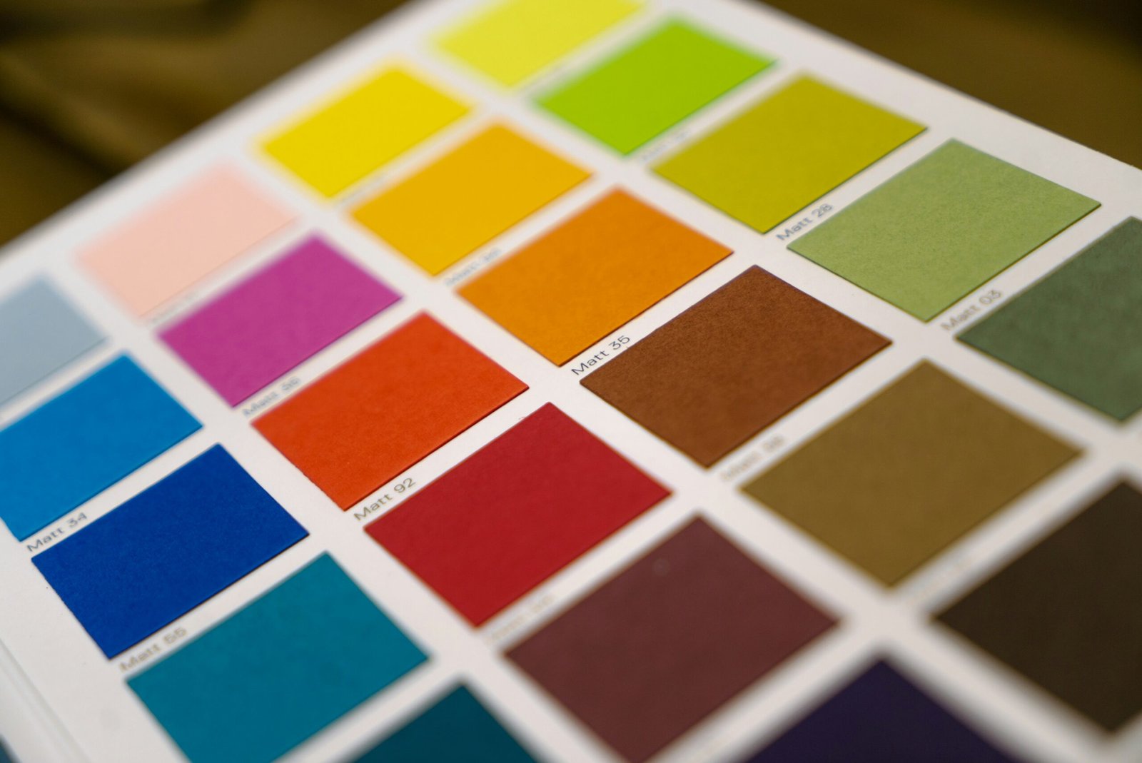
Every hue has a psychological fingerprint. In the context of home design, the emotional impact of color is what turns walls, fabrics, and accents into powerful mood enhancers. Understanding the difference between warm, cool, and neutral tones helps guide intentional choices.
Warm Tones: Energy and Connection
Warm colors like red, orange, and yellow often feel stimulating and inviting. They’re frequently used in social spaces such as dining rooms and living areas because they promote conversation and activity. According to Down2Earth Interior Design, these hues can make large rooms feel cozier and more intimate.
Personally, I’ve seen how a splash of terracotta in a living room creates a sense of grounded warmth, making guests linger a little longer. But because warm tones are so stimulating, they can overwhelm if used excessively, so accents and balance are key.
Cool Tones: Calm and Focus
Cool shades like blues, greens, and purples carry associations of water, sky, and natural landscapes. Research suggests they are more likely to support relaxation and concentration (Better Homes & Gardens). That makes them excellent for bedrooms, bathrooms, and home offices. A soft blue wall or a sage green rug can transform an ordinary room into a restorative retreat.
I once repainted my workspace from bright white to a misty blue. The shift was dramatic: my stress levels dropped, and I felt more comfortable spending long stretches focused on writing.
Neutral Tones: Balance and Versatility
Neutrals have always been staples of interior design, but they’re evolving. Shades like greige, taupe, and stone now dominate wellness-driven interiors because they pair well with natural textures and layered accents (The Spruce). Earth-inspired neutrals act as grounding backdrops, giving flexibility for bold accents without overwhelming the senses.
In fact, neutral palettes are often the unsung heroes of harmonious interiors. They allow homeowners to experiment with accent colors seasonally while keeping the overall look timeless and calming (Wikipedia).
Strategic Color Schemes and Harmonious Pairings
Choosing colors individually is one thing, but combining them into a cohesive scheme is where the psychology of color in interior design truly comes alive. The way hues interact can amplify emotions, balance energy, and even correct visual proportions within a space.
The 60 30 10 Rule
Designers often rely on the 60 30 10 rule, which recommends using:
- 60 percent as the dominant color (walls, large furniture),
- 30 percent as the secondary color (upholstery, rugs),
- 10 percent as an accent (pillows, art, small décor).
This simple ratio creates balance and visual interest without overwhelming the eye. It also ensures that even bold hues remain approachable when paired with grounding tones (Architectural Digest).
Analogous and Complementary Palettes
Analogous schemes – colors adjacent on the color wheel – naturally create harmony, while complementary palettes – opposites on the wheel – deliver contrast and vibrancy. For instance, a bedroom in soft blue tones gains energy when paired with burnt orange accents. These combinations are rooted in color theory, but they also reflect what we instinctively find pleasing in nature.
In fact, recent research suggests that color harmony in interiors often mirrors natural hue statistics. Spaces designed with ratios similar to those found in landscapes feel more balanced and comfortable (arXiv study).
Bold Modern Trends
While classic harmony never goes out of style, bold trends are reshaping how we use color today. The 2025 Color Trend Report highlights techniques like color drenching, where walls, ceilings, and trim are painted in the same shade for a cocoon-like effect (Architectural Digest). Murals, expressive palettes, and unexpected pairings are also gaining traction, allowing homeowners to express individuality while still leveraging color psychology.
From my perspective, one of the most exciting applications is using deep, saturated tones in small spaces like powder rooms. It breaks the “light colors make rooms bigger” rule but often results in jewel-box environments that feel luxurious and memorable.
Room by Room Applications for Mood and Function
One of the most effective ways to apply the psychology of color in interior design is to think about the purpose of each room and align the palette with the mood you want to create. Every space in a home has different demands, and color becomes the emotional backdrop for those functions.
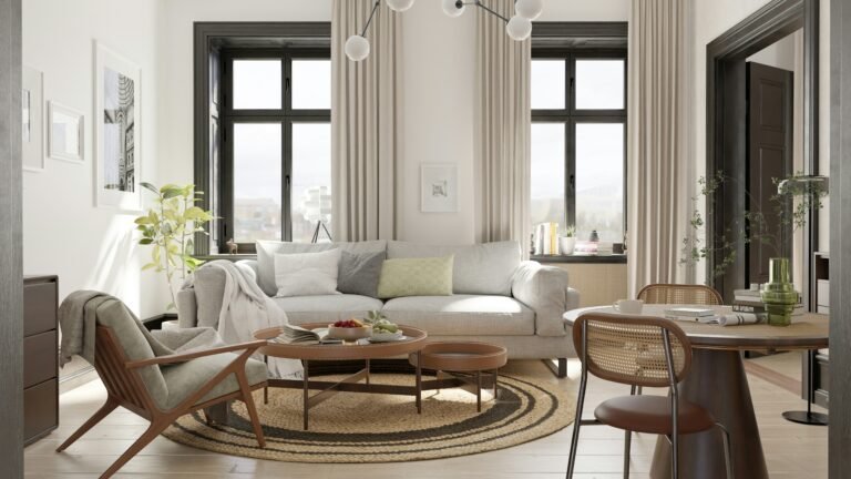
Living Rooms: Warmth and Connection
Living rooms are often the heart of a home, where family and friends gather. Warm tones like terracotta, muted gold, or deep coral can make the space feel inviting and foster conversation. Designers often balance these with soft neutrals to prevent overstimulation (Down2Earth Interior Design).
I’ve personally found that pairing earthy neutrals with a single bold accent like a rust-colored throw creates just enough energy without overwhelming the room.
Home Offices: Calm Productivity
Workspaces benefit from cool tones that promote focus and reduce stress. Sage greens and soft blues are excellent for concentration, while subtle touches of yellow can boost optimism and creativity. This aligns with principles of color psychology in home decor, where strategic hues influence performance and mindset (L34 Group).
If your office doubles as a guest room, you can still use calming tones but bring flexibility with accent pieces that shift the mood as needed.
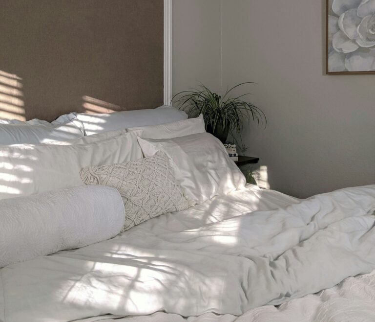
Bedrooms: Restorative Retreats
The bedroom is a sanctuary, so soothing palettes are essential. Soft pastels, muted neutrals, or cool blues foster rest and relaxation. According to color experts, spa-like atmospheres often combine pale greens and gentle grays to create serenity (Livingetc).
In my own bedroom, swapping bright artwork for muted botanical prints made a noticeable difference in how quickly I could wind down at night.
Kitchens and Dining Areas: Energy and Appetite
Reds and oranges are known to stimulate appetite, which is why they’re common in restaurants. In the home, these hues can energize a kitchen or dining room. However, modern designers often soften these shades with natural materials like wood or stone, balancing stimulation with warmth (The Spruce).
Even a few bold accessories like terracotta dishes or a burnt orange backsplash can create vibrancy without overwhelming the senses.
Bathrooms: Tranquility and Renewal
Bathrooms thrive on calming, spa-inspired tones. Pale blues, misty grays, and soft greens bring in freshness and a sense of cleansing renewal. Using neutral foundations with cool accents enhances the restorative experience.
Fitness Spaces: Motivation and Energy
If you have a home gym or workout corner, energetic hues like bright orange, lime green, or vibrant red can provide motivation and intensity. These mood enhancing colors make movement feel more invigorating and sustain energy levels throughout a session.
Practical Tips: Lighting, Texture, and Layout
Even the most thoughtfully chosen palette can fall flat if it isn’t supported by the right conditions. The psychology of color in interior design depends heavily on how hues interact with light, materials, and spatial layout.
Lighting Shapes Perception
Light alters how we perceive color, sometimes dramatically. The Kruithof curve illustrates how combinations of brightness and color temperature affect whether a room feels “pleasing” or uncomfortable (Wikipedia). Warm lighting can make reds and oranges feel cozier, while cool lighting enhances blues and greens. That means the same paint shade may look entirely different under natural daylight versus artificial light.
When I switched my living room bulbs from cool white LEDs to warm dimmable lights, my earthy neutral walls instantly felt richer and more welcoming.
Texture Enhances Depth
Color never exists in isolation it’s always interacting with texture. Matte limewash walls, plush textiles, and glossy tiles all reflect color differently, changing how we experience a space. Interior designers increasingly use tactile finishes like clay paints or textured fabrics to add dimension to otherwise simple palettes (Livingetc).
Adding a velvet throw in deep green or a woven jute rug in sandy beige can subtly shift how a color scheme feels, layering emotional impact.
Layout and Flow
Open-plan layouts require special attention to color continuity. Using a neutral foundation like soft gray or stone provides flexibility, while accent colors help define zones without erecting physical barriers (The Spruce). This strategy is especially effective for small apartments where too many competing shades can feel chaotic.
Flexibility Through Accents
Another practical approach is treating walls and large furniture as a calm backdrop while adding seasonal or mood-based accents. Swapping pillow covers, rugs, or wall art in complementary hues allows you to refresh a space without committing to a full redesign (DesignCafe).
Personally, I rotate accessories twice a year – warm rust and gold tones in autumn and winter, then refreshing blues and greens in spring and summer. It keeps my home feeling alive and responsive to the seasons.
The Science Behind Color Psychology in Interior Design
While color choices often feel instinctive, the psychology of color in interior design is grounded in real science. Understanding these foundations helps explain why some spaces feel energizing while others promote calm.
How the Brain Responds to Color
Color perception begins when light enters the eye and travels to the brain’s visual cortex. From there, signals connect with regions that regulate memory and emotion. This is why a bold red wall can feel stimulating, while a soft blue ceiling brings an immediate sense of calm (Wikipedia).
The Role of Context and Culture
Our reactions to color are also shaped by personal experience and cultural background. White, for example, is linked with purity and new beginnings in many Western cultures, but in others, it is associated with mourning. Designers need to balance these broader associations with the preferences and lived experiences of the people who will actually inhabit the space (Verywell Mind).
I’ve worked with clients who found certain colors unsettling simply because they reminded them of difficult past experiences. In those cases, adjusting to softer or more neutral tones made all the difference.
Color Harmony and Natural Balance
Studies suggest that harmonious palettes often reflect the distributions of hues found in nature. When interiors echo these natural ratios like the balance of sky, earth, and foliage in a landscape they tend to feel more pleasing and restful (arXiv research). This explains the popularity of earth tones and biophilic-inspired palettes in wellness-focused design.
Wellbeing Through Color
More than decoration, color has measurable effects on wellbeing. Calming palettes in bedrooms can support deeper rest, while invigorating shades in workout areas sustain motivation. Incorporating intentional color choices into design ensures that homes not only look beautiful but also actively contribute to mental and emotional health (Wallpaper).
Final Thoughts
Color is never just a backdrop. It is a silent but powerful force that shapes how we feel, think, and interact in our homes. From the warm energy of terracotta living rooms to the calming serenity of sage green bedrooms, every hue carries psychological weight. By combining an understanding of warm, cool, and neutral tones with thoughtful color schemes, lighting, and textures, we can design spaces that truly support both function and wellbeing.
The science confirms what many of us already sense intuitively – color influences mood, focus, and even health. Designers and homeowners alike can harness this knowledge to make interiors not only beautiful but also emotionally nourishing. And while general principles are useful, the most successful spaces also honor personal preferences and cultural context, ensuring that a home feels authentic to the people who live there.
I’ve seen firsthand how small shifts like painting a workspace in muted blue or layering earthy neutrals in a lounge can transform not only how a room looks but how it feels to inhabit. That is the real power of design: creating environments that elevate daily life.
By paying attention to the psychology of color in interior design, you can craft spaces that go beyond style and aesthetics, offering comfort, inspiration, and harmony every single day.
Frequently Asked Questions about the Psychology of Color in Interior Design
Alex is the creator of Homely Haven, a space dedicated to simple, stylish ideas for interiors and gardens alike. With a passion for cozy living rooms, inviting outdoor spaces, and practical DIY solutions, Alex shares tips and guides that help turn any house into a true home.
From budget-friendly decorating hacks to weekend garden projects, the goal is always the same: to inspire you to create spaces that feel personal, beautiful, and welcoming. When not writing, Alex is usually rearranging furniture, sketching new garden layouts, or exploring design trends for the next project.