Stop me if this sounds familiar.
You’ve spent hours picking out the perfect sofa. You found artwork that should work. You even tried rearranging the furniture twice. But something still feels… off.
It doesn’t look bad, but it doesn’t feel quite right either.
That’s not because you lack style or good taste. It’s because even the best-looking pieces can fall flat if the foundational principles aren’t there. The truth is, great interior design isn’t just about colours and trends—it’s about structure. And three of the most important building blocks are balance, rhythm, and proportion.
These principles are what give a space that effortless, put-together feel—even if it’s made up of simple or second-hand pieces. They’re also where most people unknowingly go wrong.
I’ve written this guide to help you get it right. Whether you’re decorating your first flat, updating a tired living room, or diving into design professionally, this article will give you the tools to master the foundational rules that every designer swears by—without overcomplicating it.
You’ll walk away understanding:
- What balance, rhythm, and proportion really mean in design
- How to spot when one of them is missing
- Simple ways to fix or apply them in your own space
Let’s start by untangling one of the most misunderstood concepts in interior design: balance.
Understanding Balance
You might not notice it right away, but when a room feels calm, grounded, and comfortable—it’s almost always because it’s well-balanced.
So what is balance in interior design?
Balance is all about distributing visual weight evenly across a space. It’s what keeps a room from feeling lopsided or chaotic. Think of it like this: if your room were a set of old-fashioned scales, balance would mean both sides are holding equal weight—even if they don’t look exactly the same.
There are three main types of balance in interior design:
1. Symmetrical Balance
This is the most classic form—where one side mirrors the other.
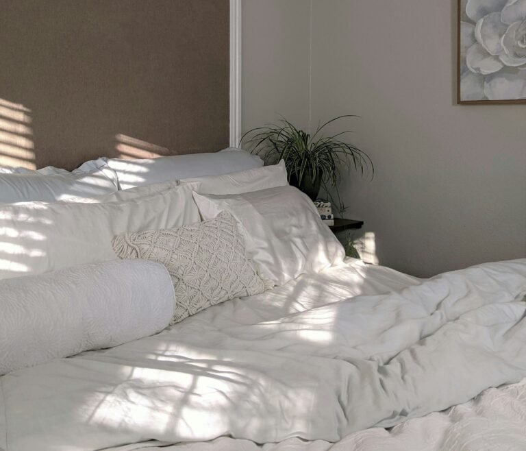
Think: two matching bedside tables with identical lamps on either side of a bed. It’s calm, formal, and often used in traditional spaces.
Why use it?
It creates a sense of order and harmony. But if overdone, it can feel stiff or predictable.
2. Asymmetrical Balance
This is where things get more interesting—and more natural. Instead of mirroring, you balance objects with different visual weights.
For example, a large sofa on one side might be balanced by two chairs and a tall plant on the other. They’re different, but they feel equally weighted.
Why use it?
It gives you more flexibility and looks more relaxed. It’s often found in modern or eclectic spaces.
3. Radial Balance
This one’s less common but very effective in certain layouts. Here, elements radiate from a central point—like chairs arranged around a round dining table or a chandelier centred in a room with symmetrical decor radiating outward.
Why use it?
It draws the eye to the centre and can feel very dynamic and inviting when done right.
How to Create Balance in Your Own Space
- Step back and squint. This sounds silly, but it helps you see visual weight rather than getting distracted by details.
- Consider colour, texture, and size. A bright red cushion might carry more visual weight than a neutral one twice its size.
- Don’t obsess over symmetry. Equal doesn’t mean identical. It just means the room feels stable, not top-heavy or empty on one side.
- Use pairs intentionally. Matching objects give instant balance—but don’t rely on them too much or your room might feel like a hotel lobby.
Understanding Rhythm
Balance makes a space feel grounded. Rhythm is what keeps the eye moving—it’s the beat of the room.
If you’ve ever walked into a room and thought, “This just flows,” rhythm is probably the reason why. It’s how your brain connects the dots between different elements in a space—through repetition, progression, contrast, or movement.
Let’s break that down.
What Is Rhythm in Interior Design?
In design, rhythm is created by repeating elements to guide the eye smoothly across a room. It could be repeated colours, shapes, lines, or textures. Rhythm is what gives your space that sense of visual harmony without it feeling boring.
There are four easy ways to create rhythm:
1. Repetition
This is the simplest and most common form. Use the same colour, shape, or pattern in multiple places.
Example:
If you have navy cushions on your sofa, a navy vase on a side table, and a navy border on your curtains—you’ve created rhythm through repetition.
2. Progression
Progression means gradually changing something in a way that still feels connected.
Example:
A series of candles in varying heights, or a set of nesting tables. The change in size adds movement while keeping a theme.
3. Contrast
Surprising, but yes—contrast can also create rhythm when used intentionally. When light and dark, rough and smooth, or big and small are placed near each other, the eye naturally moves between them.
Example:
A matte black lamp against a white wall draws attention and adds visual interest.
4. Transition
This is more about how the eye travels from one part of the room to another—often through curved lines or architectural elements.
Example:
A spiral staircase or a curved archway naturally leads your eye through a space.
How to Use Rhythm in Your Room
- Pick one or two key elements (like a colour or shape) and echo them throughout the space.
- Don’t overdo it. Repetition is great, but too much can feel forced or matchy-matchy.
- Step back and trace the path your eyes take. If you notice they bounce around randomly, you might be missing rhythm.
- Use contrast intentionally. It shouldn’t be chaotic. Think of it like punctuation in a sentence—used sparingly to keep things interesting.
Understanding Proportion
Ever seen a tiny rug under a massive sofa? Or a giant coffee table that swallows the room? That’s what happens when proportion goes out the window.
Proportion is all about how elements relate to each other in terms of size, scale, and placement. When the proportions are right, everything feels like it fits—even if your pieces are mismatched in style or colour.
Proportion vs. Scale
These two often get lumped together, but they’re not the same thing:
- Scale refers to how big something is in relation to the room itself. A high-backed armchair might feel too big in a tiny studio flat but just right in a grand sitting room.
- Proportion is about how parts of a design relate to each other. For example, how the size of a lampshade relates to the base, or the height of a table to the sofa it sits next to.
You need both working together to create harmony.
Common Proportion Mistakes
Here’s where most rooms go wrong—and how to fix them:
1. Tiny Rugs
If your rug floats in the middle of the room with all the furniture off it, it’s too small. Ideally, the front legs of your sofa and chairs should sit on the rug—or better yet, all of them.
2. Oversized Furniture in Small Spaces
If you’re constantly bumping into things, or the furniture looks like it barely fits, the scale is too big. Choose pieces that leave room to breathe.
3. Awkward Wall Art
Art that’s too small above a large sofa, or hung too high on the wall, throws the balance off. As a rule of thumb, aim for artwork to be around two-thirds the width of the furniture below it, and hang it at eye level.
4. Cluttered Surfaces
Even if each object is beautiful, too many small items grouped together can look messy. Group objects by size and height to create visual order.
How to Get Proportion Right
- Use measuring tape. Seriously. Eyeballing it rarely works.
- Visualise using painter’s tape. Mark out rug sizes, furniture footprints, or art placement before you buy or hang anything.
- Stick to the “rule of thirds.” In both furniture layouts and accessories, dividing things into thirds (rather than halves or quarters) tends to feel more natural.
- Pay attention to leg height. Furniture with exposed legs adds visual space—handy in smaller rooms.
With balance, rhythm, and proportion working together, your space starts to feel intentional. Designed. Not just thrown together.
Bringing It All Together
You’ve now got the three most important interior design principles under your belt: balance, rhythm, and proportion. But theory only gets you so far—let’s look at how they actually work together in a real space.
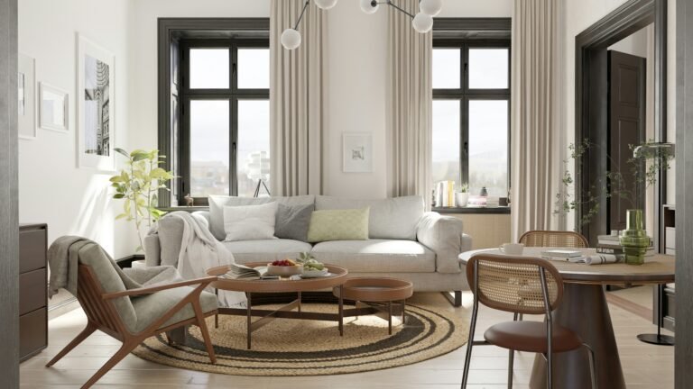
A Real-World Example: The Living Room Fix
Before:
A client had a living room that should have worked. Great furniture. Lovely colours. But it felt disjointed.
- A large sectional sofa hugged one wall, but the opposite side felt empty.
- The rug was too small—just under the coffee table with no furniture touching it.
- There were three different wood tones in the space, but no repetition.
- The artwork above the sofa looked like a postage stamp on a blank wall.
After applying balance, rhythm, and proportion:
- We added a tall bookshelf on the opposite side of the sectional to balance the visual weight.
- Swapped the rug for a larger one that anchored the front legs of the sofa and chairs, restoring proportion.
- Introduced a repeated element: a black accent that appeared in the coffee table legs, a side lamp, and a small vase—bringing rhythm through repetition.
- Hung larger artwork above the sofa, two-thirds the width of the piece below it, and dropped it to eye level for better scale.
The result?
It looked like a completely new space. But not a single piece of furniture had changed. It was all about adjusting the structure.
Quick Design Checklist: Are You Nailing the Foundations?
Use this to spot-check your own space:
✅ Balance – Does the room feel even? Is one side visually heavier than the other?
✅ Rhythm – Do your eyes naturally move from one thing to the next? Are there repeated elements?
✅ Proportion – Do your furniture and decor feel “right” for the space and each other? Nothing too big, too small, or oddly placed?
When you master these three principles, design stops feeling random and starts feeling intentional. It’s not about copying Pinterest-perfect rooms—it’s about making your space feel cohesive, comfortable, and confidently put together.
Ready to give your home a refresh? Start with just one principle, walk around your space, and see what needs a tweak. You’ll be amazed how much of a difference it makes.
Conclusion: Design That Just Feels Right
Interior design isn’t just about having a good eye—it’s about knowing why something works. And now, you’ve got that insight.
By focusing on balance, rhythm, and proportion, you can walk into any room and start making sense of what feels off—and how to fix it. These aren’t fancy rules reserved for professionals. They’re the behind-the-scenes magic that makes spaces feel cohesive, comfortable, and undeniably right.
So next time you rearrange a room or pick out a new piece, ask yourself:
- Does this balance the space?
- Does it contribute to the rhythm?
- Is it in proportion with everything else?
If the answer’s yes, you’re on the right track.
If it’s no—you now know exactly what to tweak.
Design confidence starts here.
Alex is the creator of Homely Haven, a space dedicated to simple, stylish ideas for interiors and gardens alike. With a passion for cozy living rooms, inviting outdoor spaces, and practical DIY solutions, Alex shares tips and guides that help turn any house into a true home.
From budget-friendly decorating hacks to weekend garden projects, the goal is always the same: to inspire you to create spaces that feel personal, beautiful, and welcoming. When not writing, Alex is usually rearranging furniture, sketching new garden layouts, or exploring design trends for the next project.