When you walk into a room, the first thing you notice is often how it feels. Some spaces immediately calm you, while others feel off without you quite knowing why. One of the most powerful tools behind that sense of harmony is symmetry in interior design. From classic living rooms with matching chairs and lamps to modern layouts that subtly balance shapes and colors, symmetry helps create interiors that feel intentional and complete.
I’ve always found that when a room is symmetrical, it makes me pause and breathe a little easier. There’s something deeply human about craving balance, it’s in nature, in art, and in the spaces we live in. Over the years, I’ve learned that while perfect mirror-image design can feel formal, symmetry doesn’t have to be rigid. In fact, blending it with asymmetrical or radial balance creates rooms that are both polished and inviting.
In this article, I’ll explore the different ways you can use symmetry to design balanced spaces that work with your lifestyle and personality, while avoiding common pitfalls.
What Is Symmetry in Interior Design
At its core, symmetry in interior design is about creating a sense of order and balance by arranging elements so they mirror or correspond with each other. This does not always mean a perfect reflection, but rather an intentional placement that gives a room visual stability.
Designers often describe symmetry as the foundation of balanced spaces. A symmetrical living room, for example, might feature a sofa centered along a wall with identical side tables and lamps on either end. The result is a space that feels calm and cohesive, even to someone who isn’t consciously analyzing the design.
However, symmetry isn’t limited to strict mirror images. According to Alma de Luce, symmetry in design can also be radial, where elements radiate around a central point or balanced in ways that create harmony without perfect duplication. On the other hand, publications like Livingetc highlight that overly rigid symmetry can sometimes make a space feel too formal, and suggest combining it with asymmetry for a softer effect.
In practice, symmetry is about how the human eye perceives order. When objects, colors, and shapes feel evenly distributed, the room becomes more comfortable to spend time in, no matter its style.
The Three Types of Balance
Balance is one of the cornerstones of good design. While symmetry in interior design often refers to mirror-like arrangements, balance actually comes in different forms. Understanding these three main types – symmetrical balance, asymmetrical balance, and radial balance– will help you choose the right approach for your space.
Symmetrical Balance
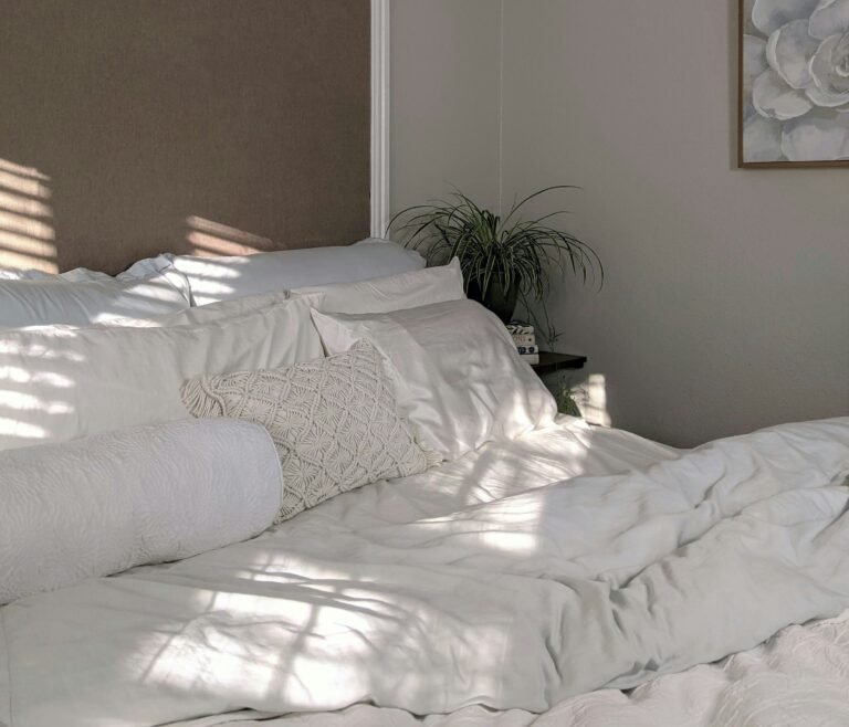
Symmetrical balance is the most traditional and perhaps the easiest to spot. It happens when elements are mirrored across a central axis. Think of a bed flanked by identical nightstands and lamps, or a fireplace with matching chairs on each side.
This type of balance creates a sense of formality and order. According to Posh Pennies, symmetrical layouts work especially well in classical interiors where structure and elegance are essential. However, if overused, they can feel predictable or even stiff.
Asymmetrical Balance
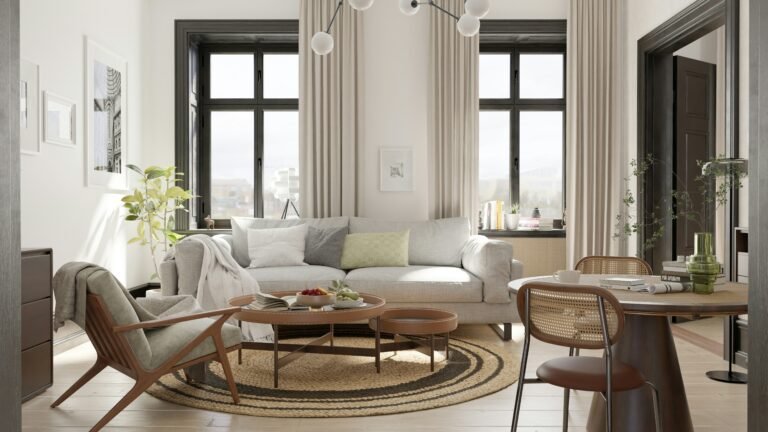
Asymmetrical balance is more relaxed and modern. Instead of mirroring identical pieces, it relies on different objects that have equal visual weight. For example, a large sofa might be balanced by two smaller armchairs, or a bold artwork could balance a tall bookshelf.
Designers often prefer asymmetry in casual or open-plan layouts because it feels dynamic and lived-in. As Vera Iconica explains, asymmetrical balance lets you play with proportions, colors, and textures without sacrificing harmony.
Radial Balance
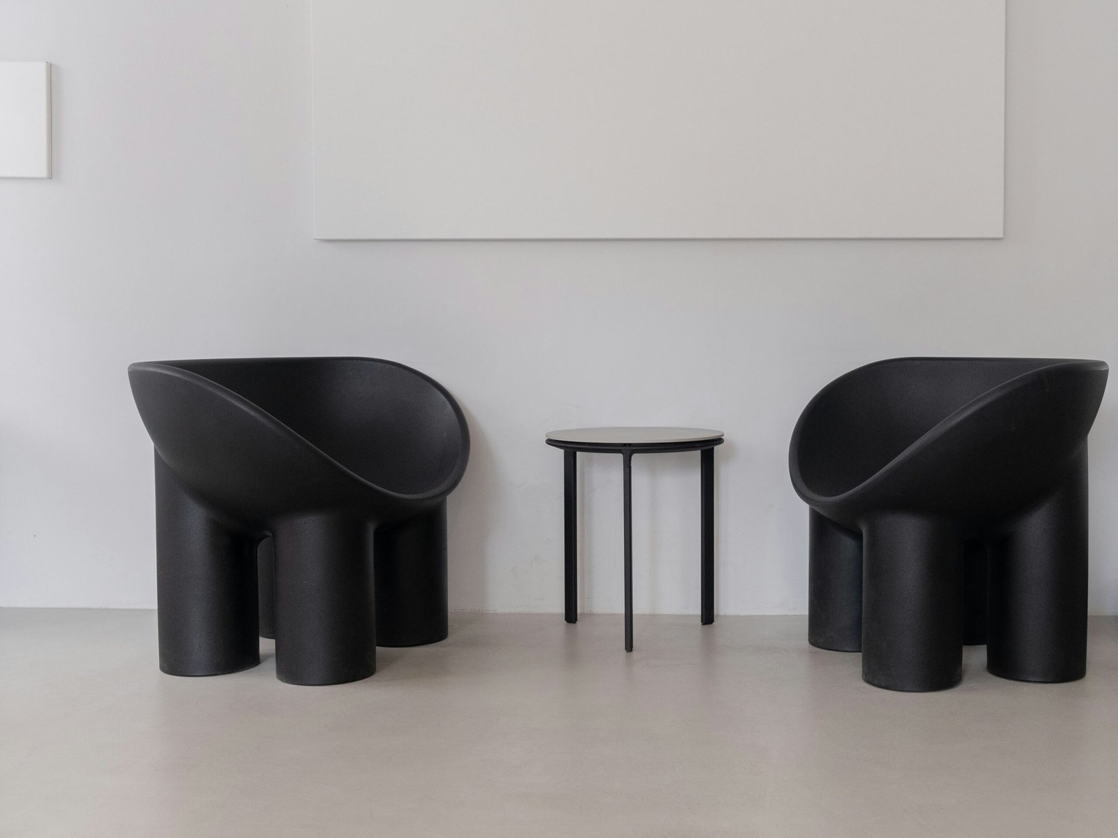
Radial balance organizes elements around a central point. The most common example is a round dining table with chairs placed evenly around it. A chandelier or ceiling medallion often enhances this effect by drawing the eye to the center.
Radial balance is less common in everyday rooms but can be striking when used intentionally. It’s especially effective in spaces like foyers, staircases, or large dining areas where you want to emphasize a single focal point. As The Gazette notes, radial layouts can add drama and sophistication while still maintaining a sense of order.
Why Symmetry and Balance Matter in Interior Spaces
A well-designed room is not just about aesthetics, it is also about how the space makes you feel. Symmetry in interior design matters because it directly influences mood, comfort, and usability. When the human eye sees balance, the brain interprets it as harmony, which is why symmetrical or evenly distributed layouts often feel more calming.
According to Sunset Magazine, people are naturally drawn to symmetry because it reflects the patterns we find in nature, such as the structure of flowers or the proportions of the human body. This connection explains why balanced spaces feel instinctively “right” to us.
At the same time, balance plays a functional role. A living room with symmetrical seating feels welcoming for conversation, while a balanced kitchen layout improves workflow. Even asymmetrical or radial arrangements contribute to this sense of usability, as long as the visual weight is thoughtfully considered.
However, balance should not be mistaken for rigidity. Publications like House & Garden warn that over-symmetry can drain personality from a room, making it look staged rather than lived in. That’s why blending symmetry with elements of asymmetry or texture often creates the most inviting interiors.
Ultimately, symmetry and balance matter because they transform spaces into environments where people feel comfortable, focused, and at ease. Without them, even the most beautifully decorated room can feel unsettled.
How to Use Symmetry in Interior Design
Applying symmetry in interior design is both an art and a science. The goal is not to make every room look like a mirror image but to create balanced spaces that feel inviting and cohesive. Here are some tried-and-true strategies to achieve that effect.
Identify Your Focal Point
Every balanced room begins with a focal point. It could be a fireplace, a large window, a bed, or even a statement artwork. Once the focal point is established, the rest of the furniture and décor can be arranged in relation to it.
As House & Garden explains, aligning your design around a focal point prevents the space from feeling scattered. Designer Hans Lorei also emphasizes that framing a focal point with symmetrical elements such as matching lamps or paired chairs draws attention to the heart of the room in an elegant way.
Use Matching Pairs for Harmony
One of the simplest ways to introduce symmetrical balance is through pairs. Identical side tables, lamps, chairs, or wall sconces instantly create a sense of order. This technique works particularly well in bedrooms and living rooms, where pairs naturally flank a central feature like a bed or sofa.
However, pairs don’t always need to be identical. They can be similar in size or visual weight, creating balance without rigidity. This subtle approach ensures your space looks curated rather than cookie-cutter.
Balance with Visual Weight, Color, and Texture
Symmetry goes beyond furniture placement, it also depends on visual weight. Dark colors, bold patterns, and large objects feel heavier than light or delicate ones. For example, a deep navy sofa might be visually balanced by a cluster of lighter chairs or a patterned rug.
Textures also play a key role. As Vera Iconica notes, incorporating varied materials like wood, fabric, or stone prevents a symmetrical room from feeling too flat or sterile. Mixing soft textiles with sleek finishes creates depth while maintaining equilibrium.
Embrace Negative Space and the Rule of Thirds
It’s tempting to fill every corner of a room, but negative space is essential for balance. Leaving breathing room around furniture and décor prevents visual overload.
Another useful guideline is the rule of thirds. Instead of splitting a wall or arrangement into two equal halves, divide it into thirds for a more natural sense of proportion. Better Homes & Gardens suggests applying this principle to gallery walls, shelving, or even sofa arrangements to keep the design visually interesting without sacrificing harmony.
Experiment with Asymmetry and the 3-5-7 Rule
Perfect symmetry can sometimes feel too formal. Introducing asymmetry helps soften the effect and adds personality. For example, instead of placing identical vases on a mantel, try grouping objects in odd numbers, a concept known as the 3-5-7 rule.
As Livingetc explains, odd-number groupings are more dynamic to the eye and work especially well in modern or eclectic interiors. They allow you to balance the room without rigid duplication.
By blending symmetrical arrangements with moments of asymmetry, you create a space that feels both structured and alive.
Common Mistakes to Avoid with Symmetry
While symmetry in interior design can create beautiful, balanced spaces, it’s easy to fall into traps that make a room feel forced or uninspired. Avoiding these common mistakes ensures your interiors remain both harmonious and full of character.
Overusing Perfect Symmetry
The biggest pitfall is relying too heavily on mirror-image arrangements. Although identical pairs on each side of a focal point feel orderly, repeating this pattern throughout an entire home can look rigid, almost like a hotel lobby. As Livingetc points out, too much symmetry can drain a room of warmth and personality.
Ignoring Scale and Proportion
Balance isn’t just about duplication, it’s also about proportion. A small lamp won’t visually balance a large armchair, even if placed symmetrically. According to The Spruce, mismatched proportions are a leading cause of awkward room layouts. Always consider the relative size and weight of items when creating symmetry.
Cluttering the Space
Some homeowners attempt to achieve balance by adding more items than necessary. But symmetry doesn’t mean filling every surface or corner. Instead, it requires restraint and negative space. Without breathing room, a symmetrical layout can quickly turn into clutter, leaving the room feeling heavy rather than harmonious.
Forgetting Functionality
Finally, symmetry should enhance, not hinder, how you use a space. For example, placing identical chairs on either side of a coffee table looks neat, but if they block walkways or feel cramped, the design has failed. As Woman & Home emphasizes, functionality and comfort must always come first.
By avoiding these mistakes, you can keep symmetry working in your favor, supporting the room’s flow while still showcasing personality and style.
Advanced Designer Tips for Balanced Spaces
Once you’ve mastered the basics of symmetry in interior design, you can start layering in more advanced techniques to create rooms that feel sophisticated yet effortless. These strategies are often what set professional interiors apart from beginner attempts.
Use Dynamic Symmetry as a Framework
Beyond simple mirror-image layouts, some designers lean on mathematical systems like dynamic symmetry. Developed in the early 20th century by theorist Jay Hambidge, this approach uses proportions found in nature and classical art to create harmony without strict repetition. While you don’t need to dive deep into the math, understanding that balance can come from natural ratios rather than identical pairings helps you design more fluid, organic spaces.
Break Symmetry Intentionally
Strict symmetry can feel predictable. One advanced trick is to establish a symmetrical foundation like matching nightstands or flanking chairs and then break it with a single contrasting element. For example, hang one bold artwork on one side or add a unique plant to offset the balance. As House & Garden notes, this makes a room feel dynamic without losing its sense of order.
Create “Faux Symmetry” in Challenging Spaces
Not every home is built for symmetry. Off-center windows or irregular layouts can make it difficult to achieve balance. In these cases, try creating faux symmetry with décor. For instance, a renter on The Sun cleverly used curtains to frame an off-center window, instantly giving the illusion of balance. Tricks like this show how small interventions can dramatically shift the perception of a space.
Layer Textures and Shapes
Advanced balance goes beyond pairs and proportions, it also relies on variety. Combining different textures, shapes, and materials within a symmetrical framework prevents the room from feeling flat. For example, a perfectly centered sofa can be dressed with pillows in varied fabrics, or a dining table can be flanked with matching chairs but topped with eclectic tableware.
By experimenting with these advanced techniques, you create interiors that feel curated, personal, and timeless – while still grounded in the principles of balance.
Conclusion
I hope this guide has shown how powerful symmetry in interior design can be when creating balanced spaces. Whether you prefer the formality of symmetrical balance, the creativity of asymmetrical arrangements, or the drama of radial layouts, the underlying goal is always the same: harmony.
What I’ve learned through both research and personal experience is that balance is not about perfection. Too much mirror-image design can feel rigid, while ignoring balance altogether leaves a room unsettled. The sweet spot lies in blending structure with flexibility, using symmetry as your foundation, then layering in texture, proportion, and a touch of asymmetry to make the space feel alive.
If you’re designing or refreshing a room, start by identifying your focal point, work with pairs where they make sense, and let negative space do some of the heavy lifting. Most importantly, don’t be afraid to break the rules once in a while. A truly balanced home feels both polished and personal and that’s what makes it timeless.
Frequently Asked Questions
Alex is the creator of Homely Haven, a space dedicated to simple, stylish ideas for interiors and gardens alike. With a passion for cozy living rooms, inviting outdoor spaces, and practical DIY solutions, Alex shares tips and guides that help turn any house into a true home.
From budget-friendly decorating hacks to weekend garden projects, the goal is always the same: to inspire you to create spaces that feel personal, beautiful, and welcoming. When not writing, Alex is usually rearranging furniture, sketching new garden layouts, or exploring design trends for the next project.