Learning how to mix patterns and textures in home decor might feel intimidating at first, but when it’s done with intention, it transforms a room into a space that feels both inviting and visually dynamic. Patterns bring rhythm and energy, while textures add depth and comfort. Together, they create a home that reflects personality and style.
I remember the first time I tried layering patterns—it was a disaster. Stripes, florals, and polka dots all fighting for attention in one small living room. The result? A cluttered, overwhelming mess. But with a few simple rules and a better understanding of how patterns and textures work together, I learned how to strike the right balance. Now, mixing them feels less like a gamble and more like a design strategy.
In this guide, you’ll discover proven techniques to mix patterns and textures in home decor for a cohesive look. We’ll cover how to start with a color foundation, vary pattern scales, layer textures thoughtfully, explore bold trends like pattern drenching and power clashing, and balance it all with grounding solids. Whether you lean toward subtle elegance or bold expression, these steps will give you the confidence to create harmony in your home.
Why Mixing Patterns and Textures Matters
When you mix patterns and textures in home decor, you’re doing more than decorating—you’re shaping the overall mood and energy of a room. Designers often emphasize that balance and cohesion are what separate a stylish space from one that feels chaotic (The Spruce). It’s not about following rigid rules, but about creating harmony so your eye knows where to rest.
I learned this the hard way. In one of my first apartments, I combined bold stripes with oversized florals and tiny polka dots, all in clashing colors. The result was so overwhelming I couldn’t even relax in the room. Over time, I discovered that the key isn’t avoiding patterns but learning how to connect them through color, scale, and texture.
That’s why mixing patterns and textures matters, it turns design into storytelling. A soft wool rug under a sleek leather sofa with patterned cushions doesn’t just look good, it feels inviting. The right combinations make a space come alive, while still feeling cohesive and comfortable.
Start with a Color Cohesion Base
The easiest way to begin mixing patterns and textures in home decor is by grounding your design with a cohesive color palette. Think of color as the glue that holds everything together. Even if you’re using stripes, florals, or geometric prints, a shared color thread keeps the look harmonious instead of hectic.
Most designers recommend starting with two to three main colors, including at least one neutral. Neutrals like white, beige, or gray make excellent backdrops because they let other shades shine. Then, add one or two accent colors that repeat across your patterns and textures. For example, a navy-and-cream rug can pair beautifully with cushions that feature touches of navy, cream, and maybe a softer accent like blush or mustard (Decorilla).
From my own experience, this step alone can save a lot of frustration. I once fell in love with a patterned rug in deep green, but when I tried to pair it with a bright red floral cushion, the clash was immediate. Once I shifted to accents in muted gold and soft cream, both of which echoed details in the rug, the whole room felt intentional rather than jarring.
A few practical tips when choosing your palette:
- Limit your palette – Stick to three main colors for a cohesive base.
- Repeat colors – Make sure at least one hue appears in multiple patterns.
- Add texture in similar shades – For example, a beige knit throw layered over a beige linen sofa adds depth without introducing new colors.
When you start with color cohesion, you create a visual thread that allows you to confidently layer patterns and textures without losing balance.
Vary Pattern Scale the Right Way
One of the most effective tricks when you mix patterns and textures in home decor is to play with scale. Without variation, patterns can either overwhelm or disappear into the background. The magic happens when you combine large, medium, and small designs in the same space.
Designers often call this the “rule of three” in pattern mixing. For example:
By combining these, you build a natural hierarchy where each pattern has its place. The large-scale element usually acts as the anchor, while medium and small patterns add rhythm and detail (The Interior Design Nook).
I like to think of it as composing music: the big pattern is the melody, the medium one adds harmony, and the smallest details are like background notes that bring the whole arrangement together. When I styled my living room, I started with a large Moroccan-style rug in earthy tones, layered in striped cushions, and topped it off with a few small-scale patterned throws. The balance was immediate, and the space felt intentional rather than thrown together.
A helpful tip: keep at least one scale dominant. If everything is loud and oversized, the room feels chaotic. If everything is small and busy, the room feels fussy. Balancing scales creates depth without clutter.
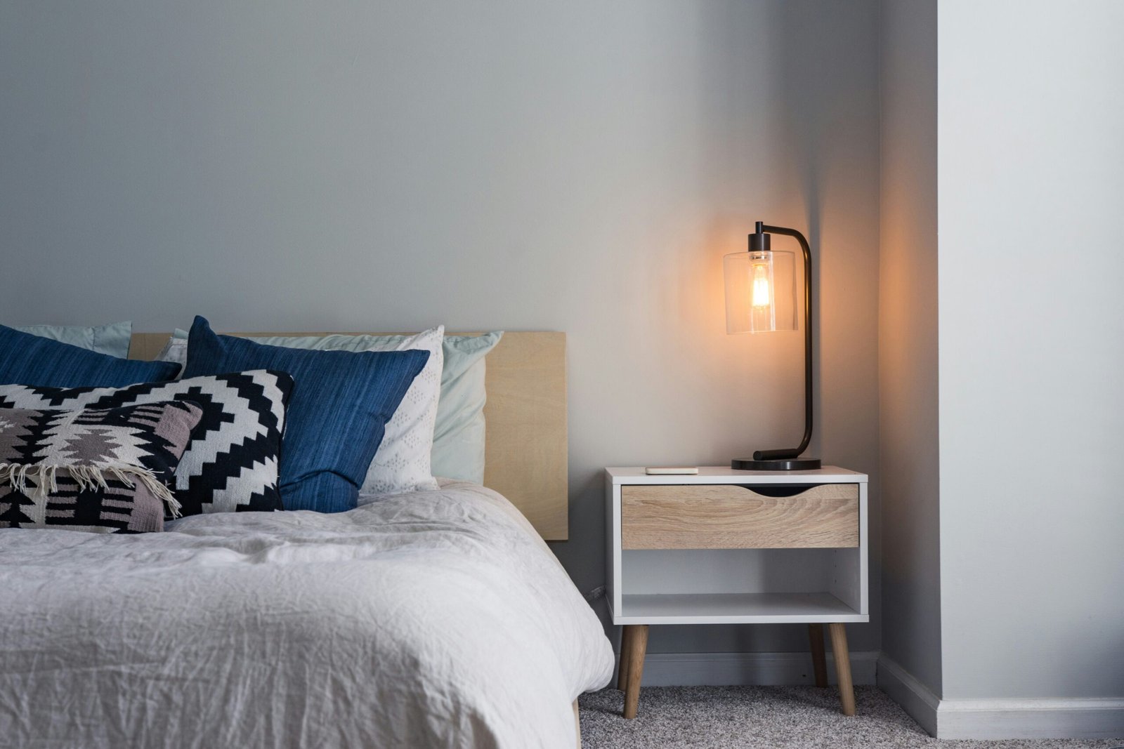
Layer Textures for Depth
Patterns may catch the eye first, but textures make a room feel alive. When you mix patterns and textures in home decor, layering tactile elements is what gives your space warmth and character. A smooth leather sofa, a chunky knit throw, a velvet cushion, and a rustic wood table can all coexist beautifully when their textures are thoughtfully balanced.
Design experts often recommend pairing opposites to create contrast and interest—sleek with rough, soft with hard, matte with glossy (The Spruce). For instance, a cool marble coffee table paired with a shag rug feels sophisticated yet inviting.
From my own home, I’ve found that texture can rescue even the simplest palette. In my neutral living room, a mix of linen curtains, a wool rug, and velvet cushions transformed what could have been a flat beige box into a space that feels layered and intentional. None of these pieces shout with color or pattern, but their tactile qualities add richness.
Here are a few easy ways to layer textures:
One caution: not all textures work well together. For example, velvet and chenille can look too similar and end up clashing rather than complementing. Aim for variety, but make sure each texture has a purpose in the overall story of your room.
Use Pattern Drenching – Bold but Balanced
Pattern drenching is a bold design trend where you repeat and layer multiple patterns across a single room. Instead of sprinkling a few prints here and there, you allow them to dominate—walls, furniture, textiles, even accessories. When done thoughtfully, it creates a rich, maximalist style that feels intentional rather than overwhelming (Southern Living).
The key is balance. Start with a lead pattern – this could be wallpaper, a rug, or even an upholstered sofa. Then introduce supporting patterns that echo its colors or motifs. Stripes, checks, or small-scale geometrics often pair well with bold florals or damasks. Finally, insert areas of solid color to give the eye somewhere to rest. Without these pauses, a drenched room can quickly tip into chaos.
When I tried this approach in a small powder room, I chose a large floral wallpaper as the lead pattern. To complement it, I added striped towels in coordinating shades and a tiny geometric tile on the floor. A simple white vanity acted as the neutral anchor. Instead of clashing, the patterns built on one another, turning a small space into a jewel box.
A few quick tips for pattern drenching:
This approach is daring, but if you start small like a bathroom, entryway, or accent wall you can build confidence before trying it in larger rooms.
Power Clashing with Control
Power clashing is the art of combining patterns that traditionally “shouldn’t” go together. Think stripes with florals, plaids with animal prints, or bold abstracts with polka dots. When it’s done well, the result is energetic and stylish rather than chaotic (Real Simple).
The secret to successful power clashing is finding a unifying element. That could be a common color, a similar scale, or even a shared design theme. For example, pairing a navy-and-white striped rug with a floral chair that also features navy helps connect the two very different patterns. Without that link, they’d compete rather than complement.
In my own home, I once paired a bold abstract rug with wide-striped curtains. At first, I worried it would feel too loud. But since both patterns shared muted blue tones, the combination felt cohesive and deliberate. The clashing actually added energy, and the room suddenly had personality.
Here are a few ways to keep power clashing under control:
- Stick to two main patterns – more than that can tip the balance.
- Look for color overlap – even one shared shade can tie things together.
- Balance scales – if one pattern is large and bold, keep the other smaller or more delicate.
- Ground with neutrals – add plain upholstery, walls, or accessories so the clashing doesn’t overwhelm.
Power clashing works best in spaces where you want vibrancy and drama like living rooms, dining areas, or even a creative home office. It’s not about breaking rules recklessly, but about bending them with purpose.
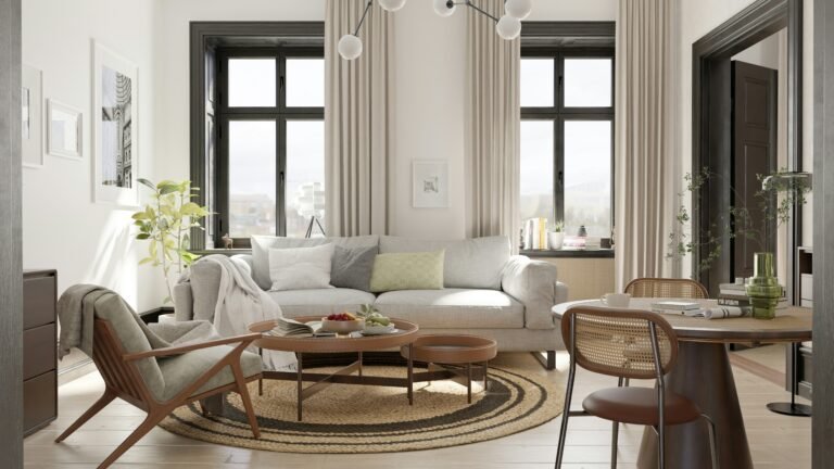
Ground with Solids and Focal Points
No matter how adventurous your mix of patterns and textures becomes, every room needs grounding elements. Solids and focal points act like the “breathing space” in design, giving your eyes a place to rest and keeping the overall look from becoming overwhelming.
One simple way to ground a space is by using solid-colored upholstery, walls, or large furniture pieces. For instance, if you have patterned curtains and a patterned rug, a plain sofa in a neutral fabric balances them out. Solids don’t have to be boring, they provide the backdrop that allows bolder elements to shine.
A focal point is equally important. This could be a dramatic wallpapered wall, a richly patterned rug, or even a standout piece of furniture. Once you’ve chosen your focal point, let it take the lead and build other patterns and textures around it. If the rug is bold, keep the cushions smaller in scale. If the wallpaper is vibrant, pair it with simple drapes and understated accessories.
In my dining room, the focal point is a patterned area rug with earthy tones. To let it stand out, I chose a solid wood table and plain linen drapes. Then I sprinkled in a few patterned cushions on the dining chairs in coordinating colors. The result feels balanced and curated instead of chaotic.
A few guiding tips:
- Choose one strong focal pattern and let it lead the room.
- Use solids on large pieces like sofas, beds, or cabinetry.
- Keep accent patterns supportive rather than competitive.
- Don’t be afraid of empty space—sometimes a plain wall or cushion is the detail that makes everything else work.
By grounding your design with solids and establishing a clear focal point, you give all your patterns and textures a framework to work within.
Practical Steps and Visual Hierarchy
By now, you’ve seen how color, scale, texture, and focal points all work together. But when you’re actually standing in your living room with fabric swatches and paint samples, it can still feel overwhelming. That’s where a simple step-by-step approach comes in handy.
Here’s a practical process I like to follow when mixing patterns and textures in home decor:
- Define your palette – Pick two accent colors and one neutral as your foundation. This ensures everything ties back to a common thread.
- Choose a lead pattern – This could be a rug, wallpaper, or even a patterned sofa. Let this element set the tone for the rest of the room.
- Layer pattern scales – Introduce one medium-scale pattern and one small-scale pattern to balance the larger design.
- Add texture variety – Combine smooth with rough, soft with hard. Think velvet cushions against a wooden bench or linen curtains beside a metal floor lamp.
- Ground with solids – Anchor bold patterns with plain upholstery, painted walls, or solid drapes.
- Experiment with bolder techniques – Try power clashing or pattern drenching in small doses before committing to an entire room.
- Step back and edit – Once everything is in place, pause. Sometimes the space needs one less cushion or a shift in scale to feel right.
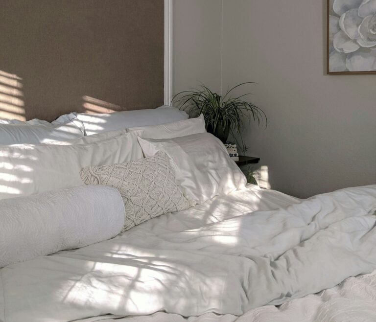
When I redesigned my bedroom, I followed these exact steps. I started with a muted palette of cream, sage green, and terracotta. The lead pattern was a botanical duvet cover. Then I added a medium-scale striped throw, a small herringbone cushion, and layered textures like a knitted blanket and a linen headboard. A plain cream rug grounded the mix. By working step by step, I avoided the trial-and-error chaos I used to fall into.
Visual hierarchy is what makes this process successful. Just like in graphic design, your eye should be guided naturally from the boldest element to the supporting ones. With clear anchors and intentional layering, your room feels cohesive and welcoming instead of busy.
Conclusion
Learning how to mix patterns and textures in home decor is less about following rigid rules and more about building confidence through structure. When you start with a cohesive color palette, vary your pattern scales, and layer textures with intention, you create depth and harmony. Add in techniques like pattern drenching or power clashing, and you can push your design toward bold expression without losing balance.
For me, the turning point came when I realized I didn’t have to avoid patterns out of fear. Instead, I could lean into them as long as I gave my room a clear focal point and used solids to ground the mix. The first time I nailed the balance, combining a patterned rug, striped cushions, and textured throws, it felt like unlocking a design superpower.
If you’re just starting out, begin small: a cushion, a throw, or even a rug that ties into your existing palette. Layer from there, and let your space evolve over time. With practice, you’ll find that mixing patterns and textures doesn’t just make a room look good—it makes it feel personal, layered, and full of life.
Frequently Asked Questions About Mixing Patterns and Textures in Home Decor
Alex is the creator of Homely Haven, a space dedicated to simple, stylish ideas for interiors and gardens alike. With a passion for cozy living rooms, inviting outdoor spaces, and practical DIY solutions, Alex shares tips and guides that help turn any house into a true home.
From budget-friendly decorating hacks to weekend garden projects, the goal is always the same: to inspire you to create spaces that feel personal, beautiful, and welcoming. When not writing, Alex is usually rearranging furniture, sketching new garden layouts, or exploring design trends for the next project.