I’ve always believed that decorating with neutrals is one of the most powerful ways to transform a home into a place of calm, style, and warmth. While bold colors can make a statement, it’s the quiet sophistication of neutrals that creates a timeless backdrop for everyday living. Neutrals are more than just whites and beiges, they include a rich spectrum of shades like greige, taupe, ivory, stone, and even soft charcoal. When combined thoughtfully, these tones can make your home feel inviting, stylish, and endlessly versatile.
In today’s fast-paced world, many homeowners are drawn to neutral home decor because it reduces visual clutter and promotes serenity. Designers consistently highlight that neutrals provide flexibility, allowing you to refresh your look seasonally with accessories, art, or textures without redoing your entire space. From my own experience, layering neutrals has made my living spaces feel cohesive and adaptable, evolving with my style over time.
In this guide, we’ll explore why neutrals work so well, the key principles behind decorating with them, and room-by-room tips to help you create a stylish and inviting home. Whether you’re starting fresh or refreshing your current interiors, you’ll find inspiration and practical strategies to bring your neutral palette to life.
Why Neutral Home Decor Works
One of the biggest reasons neutral home decor remains a favorite among designers and homeowners is its timeless appeal. Unlike trendy color palettes that can feel dated after a few years, neutrals offer longevity and flexibility. A well-curated neutral scheme creates a foundation that can adapt as your style evolves.
1. Neutrals create calm and balance
A neutral palette naturally promotes a sense of calm. Soft whites, creams, and taupes reflect light beautifully, opening up spaces and making them feel more relaxing. Interior experts at The Spruce note that neutrals help reduce visual clutter, making rooms feel more harmonious and less overwhelming.
2. They are versatile and future-proof
One of my favorite aspects of decorating with neutrals is how easily they adapt to change. You can refresh a room simply by swapping out accent pillows, rugs, or art without repainting or replacing furniture. As Allisa Jacobs explains, neutrals provide a flexible backdrop that grows with you over time.
3. Neutrals reduce decision fatigue
With bold colors, every choice can feel high-stakes. Neutrals remove that pressure. Choosing from a palette of warm beiges, greiges, or soft grays gives you consistency while still allowing room for creativity. Personally, I’ve found this makes the decorating process more enjoyable because I can focus on textures, materials, and personal touches instead of worrying about clashing shades.
Key Principles of Decorating with Neutrals
Layering Neutrals for Depth
The secret to a beautiful neutral home decor scheme is layering. Using only one shade of beige or gray can leave a room feeling flat, but combining ivory, taupe, greige, and stone introduces richness and visual depth. Interior stylists at Shabbyfufu emphasize that layering shades in textiles, furniture, and finishes is what makes a neutral palette come alive.
- Tip: Start with a base color for walls, then layer complementary tones through rugs, throws, and accent chairs.
- Personal insight: When I redecorated my dining space, I used soft cream walls, a linen tablecloth in taupe, and darker oak chairs. The mix of tones instantly gave the room more character.
Warm vs Cool Undertones and the Hidden Hue Rule
Every neutral carries a subtle undertone – yellow, pink, or blue – that influences how it looks in your space. This is often called the “hidden hue.” According to Livingetc, mismatched undertones are the number-one reason neutral rooms can feel “off.”
- Tip: Identify the undertone of your dominant shade (warm or cool) and stick within that family.
- Example: If your sofa is a warm beige with yellow undertones, avoid pairing it with a cool gray paint. Instead, choose a complementary warm taupe or greige for harmony.
Texture is Everything
When decorating with neutrals, texture becomes the star of the show. Without bold colors to lean on, texture adds interest and dimension. Think chunky knit throws, velvet cushions, woven baskets, and natural stone.
- Checklist of textures to try:
As The Spruce explains, texture ensures a neutral palette feels dynamic instead of bland. I’ve personally found that even one textured accent like a nubby wool rug can transform a plain room into something cozy and layered.
Balancing Light and Dark Neutrals
A successful neutral palette isn’t all light or all dark, it’s a mix. Light neutrals create airiness, while darker shades like espresso, slate, or charcoal provide grounding. Designers at Homes & Gardens recommend using darker tones in furniture or trim to anchor a room and prevent it from feeling washed out.
- Tip: If your walls are light beige, consider a darker sofa or sideboard to add balance.
- Personal insight: I used a deep charcoal armchair in my otherwise pale living room, and it instantly made the space feel more sophisticated.
Natural Elements and Metallic Accents
Bringing in natural elements like wood, stone, or leather adds warmth, while metallic accents provide polish. A neutral palette thrives on variety in material. A brass lamp, a marble coffee table, or a wooden console can elevate the entire room.
Designers at BBC Maestro note that natural finishes prevent neutrals from feeling sterile. Personally, I love pairing soft linen upholstery with a hammered brass tray, it’s subtle, but the shine adds sophistication.
Add Contrast via Black, Patterns, and Personal Style
A touch of black, a bold pattern, or even an art piece with graphic lines can make a neutral palette feel curated. Black accents, whether a coffee table, light fixture, or picture frame anchor the design and draw the eye.
- Patterns that work well in neutrals: herringbone, pinstripes, subtle checks.
- My experience: I introduced a black-framed mirror above a beige sofa. The contrast instantly sharpened the look while keeping the room soft and welcoming.
As Better Homes & Gardens explains, contrast is the detail that prevents neutral spaces from feeling one-dimensional.
Room by Room Practical Tips
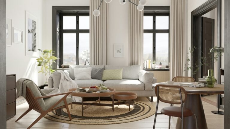
Living Room
The living room is where a neutral palette can truly shine, offering both comfort and sophistication. To avoid the sterile feel of all-white walls, opt for off-white or warm greige shades. Experts at Livingetc note that off-white paint brings warmth and dimension that pure white often lacks.
- Layer furniture and textiles: Combine a soft beige sofa with linen cushions, a textured rug, and a darker neutral armchair for balance.
- Introduce contrast: A black coffee table or dark wood sideboard can anchor the space.
- Personal tip: In my own living room, a mix of cream walls and a taupe sofa allowed me to switch out accent pillows seasonally—everything still felt cohesive.
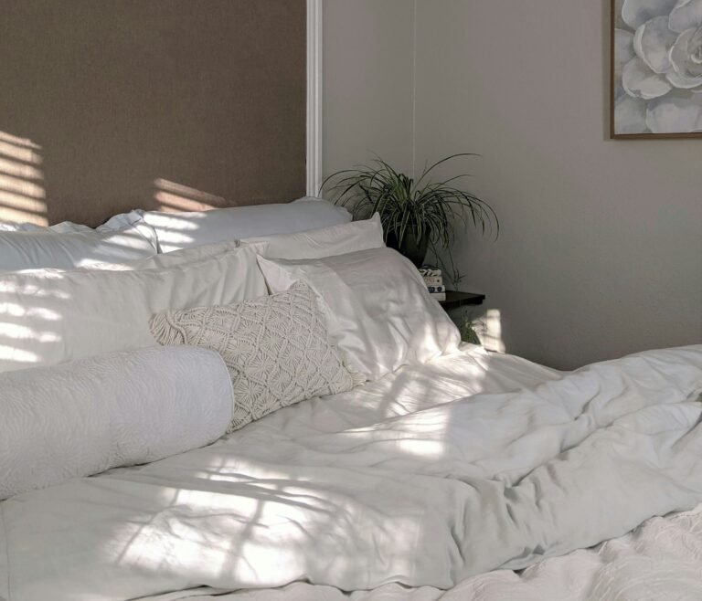
Bedroom
The bedroom is a sanctuary, and a warm neutral palette sets the tone for rest and relaxation. Think soft taupe walls, ivory bedding, and a wool throw in charcoal for subtle contrast.
- Focus on fabrics: Use layers of linen, cotton, and wool to make the space feel cozy.
- Accent with natural textures: A cane headboard or wooden side tables bring warmth.
- Designer tip: According to The English Home, using tactile finishes in neutral bedrooms prevents the look from feeling too minimal or cold.
Kitchen
A neutral kitchen can feel both timeless and high-end when styled correctly. Warm neutrals such as taupe, mushroom, or stone gray make a wonderful backdrop for natural materials.
- Cabinetry: Matte finishes in greige or cream feel fresh and refined.
- Countertops: Stone, marble, or quartz add texture and durability.
- Hardware: Mixing metals such as brass handles with nickel faucets creates a layered, designer look.
I love how neutrals allow kitchens to remain versatile. For example, when I chose soft mushroom cabinetry, I could easily change the look of my kitchen simply by swapping out lighting fixtures and bar stools. As The Sun highlights, the right neutral paint can even make a home look more expensive.
Common Mistakes to Avoid
Even though neutral home decor is versatile and timeless, there are a few pitfalls that can make a space feel flat or uninspired. The good news is that with a little awareness, these mistakes are easy to avoid.
1. Overusing stark white
Crisp, bright white might seem like the ultimate neutral, but when used alone it can feel cold and clinical. Designers at Livingetc suggest opting for off-white or warm neutrals instead, which reflect light more softly and create a welcoming atmosphere.
2. Ignoring undertones
The “hidden hue” in neutrals – warm or cool – can make or break your palette. Mismatched undertones create a jarring effect. Sticking to either warm or cool families ensures a harmonious look, as emphasized by Livingetc.
3. Being too matchy-matchy
Using the same shade across walls, furniture, and textiles can leave a room looking flat. Style expert Emily Henderson points out that layering different tones is what gives neutral spaces depth and interest.
4. Skipping texture and accents
A lack of texture or contrast makes neutral spaces fall into the “bland” category. Incorporating woven fabrics, metallic finishes, and even small black accents prevents monotony.
5. Forgetting personal style
Neutral doesn’t mean boring. Without your own personality – through art, books, or statement pieces – a neutral room can feel generic. Neutrals are the canvas, but your lifestyle and taste bring the story to life.
Conclusion
Decorating with neutrals is far more than choosing beige walls or cream sofas, it’s about crafting a timeless, layered, and inviting home. By understanding undertones, embracing texture, balancing light and dark shades, and adding thoughtful contrast, you can create spaces that feel elegant yet deeply personal.
What I love most about neutrals is their flexibility. In my own home, a neutral palette has allowed me to refresh rooms without starting from scratch. A new throw blanket, a change in artwork, or even a single metallic accent has been enough to shift the mood while keeping the foundation intact. That’s the beauty of a neutral scheme: it adapts to life as it evolves.
Whether you’re redecorating one room or your entire home, neutrals give you the perfect canvas to express your style. They offer calm when you need it, sophistication when you want it, and warmth that never goes out of season. With a thoughtful approach, you can transform any space into a haven that feels both stylish and inviting.
Frequently Asked Questions
Alex is the creator of Homely Haven, a space dedicated to simple, stylish ideas for interiors and gardens alike. With a passion for cozy living rooms, inviting outdoor spaces, and practical DIY solutions, Alex shares tips and guides that help turn any house into a true home.
From budget-friendly decorating hacks to weekend garden projects, the goal is always the same: to inspire you to create spaces that feel personal, beautiful, and welcoming. When not writing, Alex is usually rearranging furniture, sketching new garden layouts, or exploring design trends for the next project.