When it comes to decorating a home, few elements bring as much warmth and character as natural wood. Yet I often hear people worry that different finishes will clash. They wonder if a walnut coffee table will fight with oak floors, or if a cherry cabinet can sit comfortably next to pine shelves. The good news is that you absolutely can mix wood tones successfully. In fact, doing so often creates a richer, more layered look than sticking with a single finish.
Designers agree that mixing wood tones gives a room depth, personality, and a lived-in feel that looks curated rather than catalog-perfect. Instead of appearing mismatched, the right combinations tell a story. They balance warmth with coolness, light with dark, and rustic charm with modern polish. When you learn a few core guidelines, you can confidently blend everything from honey oak to deep espresso without worrying about clashing.
In this guide, I’ll share both expert tips and my own experiences with combining different woods at home. We’ll cover how to choose a dominant wood tone, how to recognize undertones, and how to balance contrast for a cohesive flow. By the end, you’ll see that mixing wood tones is less about following strict rules and more about creating harmony.
Step by Step Guide to Mix Wood Tones
Choose a Dominant Wood Tone
Every successful design starts with an anchor, and in this case that anchor is your dominant wood tone. This is usually the largest surface in the room, such as your flooring, cabinetry, or a substantial piece like a dining table. By identifying this first, you set the stage for how other woods will interact.
Design experts consistently recommend this approach. According to Real Simple, starting with a dominant wood tone ensures cohesion and makes it easier to decide which additional tones will complement the space. Think of it as establishing the main character in your design story, everything else plays a supporting role.
When I design a room, I often “audition” pieces by comparing them directly against the floor or another large anchor. If my flooring is a warm mid-tone oak, I might introduce a darker walnut table for contrast and then echo that walnut in smaller details like picture frames. This method keeps the room grounded while still allowing for variation.
Choosing a dominant wood tone also helps you avoid cluttered visuals. Without it, a room can look chaotic, as if every piece is competing for attention. With it, your eye naturally reads the largest element first and then appreciates the supporting tones layered around it.
Match Undertones for Cohesion
Once you’ve chosen your dominant wood tone, the next step is to pay close attention to undertones. Just like paint, wood carries subtle hints of color that influence how it reads in a room. Undertones generally fall into three categories: warm (yellow, red, or orange), cool (gray or blue), and neutral (balanced and muted).
Designers often stress this as the make-or-break factor. The Spruce notes that matching undertones is the simplest way to ensure different woods feel like they belong together. For instance, a warm cherry dresser pairs beautifully with golden oak floors, while a cool-toned ash bench feels right at home next to gray-stained pine.
In my own projects, I’ve learned that undertones are sometimes more noticeable in natural daylight than in artificial light. I like to place samples near windows to see how they react throughout the day. What looks perfectly neutral under a showroom lamp may reveal a golden or reddish cast once it’s in your home.
The key isn’t to use only one wood species, but rather to stay consistent with the undertones across pieces. If your anchor wood is warm, other warm woods will harmonize, even if they’re lighter or darker. Neutral undertones, on the other hand, offer flexibility – they can swing slightly warm or cool, making them easier to mix.
By keeping undertones aligned, you create a sense of cohesion that allows contrast and variation to shine without creating visual conflict.
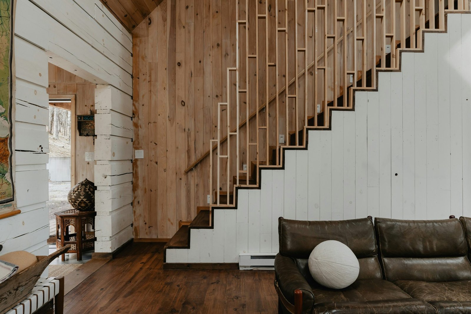
Use Contrast with Light and Dark Woods
After you’ve chosen a dominant wood tone and matched undertones, contrast is what brings excitement to the mix. Pairing light and dark woods prevents a room from feeling flat and gives it visual rhythm. Think of it like music, the highs and lows create interest, while repetition creates harmony.
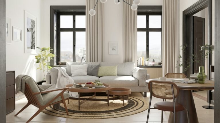
Designers often recommend intentionally mixing at least two to three levels of depth. For example, Chris Loves Julia suggests balancing light, medium, and dark tones to keep a space from leaning too heavily in one direction. A pale oak floor, a mid-tone walnut coffee table, and a dark mahogany side chair can work together beautifully when their undertones align.
I’ve personally found contrast especially helpful in open floor plans. When everything is light, the eye has nowhere to rest. Introducing a dark piece like a rich walnut media console against light flooring immediately anchors the space. On the flip side, a lighter wood element can brighten a room dominated by darker tones, preventing it from feeling heavy.
The trick is moderation. Too much contrast without repetition can look jarring. That’s why designers recommend repeating a contrasting tone at least once elsewhere in the room, perhaps through smaller accessories or trim. This subtle repetition ties the look together so that contrast feels intentional, not accidental.
By thoughtfully layering light and dark woods, you’ll give your home dimension while keeping the overall design cohesive.
Repeat Wood Tones for Balance
One of the most effective ways to create harmony when you mix wood tones is through repetition. If a wood tone only appears once in a room, it can look out of place, almost like a mistake. But when that same tone shows up in at least two or three areas, it feels deliberate and balanced.
Design experts highlight this as a key step. According to MyDomaine, repeating a shade in more than one element such as a side table and a picture frame, or a headboard and a bench helps anchor the design. Similarly, Chris Loves Julia explains that clustering multiple wood tones in a single corner without repeating them elsewhere makes the space feel unbalanced.
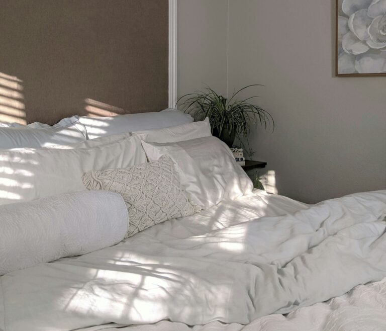
In my own living room, I learned this lesson the hard way. I had a single dark walnut coffee table sitting on pale oak floors. While the table itself was beautiful, it felt heavy and awkward until I introduced matching walnut frames on the wall and a small side chair with similar tones. Instantly, the room felt pulled together.
Repetition doesn’t have to mean matching large pieces. Small details like a lamp base, a shelf, or even the edge of a picture frame can echo a wood tone effectively. Think of it as weaving threads of the same color throughout a fabric; the repeated strands bring structure to the whole.
By ensuring that every wood tone appears more than once, you create balance and make your design feel intentional rather than accidental.
Tie It Together with Neutral or Metal Elements
Even when undertones align and repetition is in place, mixed woods can still feel busy if there’s nothing to break them up. That’s where neutrals, painted finishes, and metal accents come in. These elements act like a buffer, softening transitions between different wood tones and helping the eye rest.
The Decorologist suggests using painted or metal furniture pieces to bridge the gap between contrasting woods. For instance, a painted white sideboard between a dark walnut table and a lighter oak floor instantly calms the space. Similarly, matte black hardware or brass lighting can create a visual thread that connects different finishes without overwhelming them.
I often rely on this technique when a room has more than three distinct wood tones. In my dining area, for example, I have oak floors, a walnut table, and a pine cabinet. Adding soft gray dining chairs and a brushed nickel light fixture tied the look together seamlessly. Without these neutral and metallic “connectors,” the woods might have felt like they were competing.
Homes & Gardens points out that mismatched pieces can feel cohesive when united by shared design details, whether that’s a paint color, a metal accent, or even upholstery. Neutrals serve the same role, they create a backdrop that lets each wood tone shine while maintaining harmony in the overall scheme.
By weaving in neutrals, paint, or metals, you’ll give your space a sense of polish and prevent mixed woods from feeling chaotic.
Use Rugs to Ground Mixed Woods
Rugs are one of the most underrated tools when it comes to balancing wood tones. They act as a visual divider, softening the transitions between furniture and flooring while adding texture and warmth. If you’re nervous about mixing woods, a well-chosen rug can instantly pull everything together.
Design experts like The Decorologist emphasize that rugs help prevent clashing by creating breathing room. For example, placing a neutral rug under a dark coffee table that sits on lighter floors ensures the contrast feels intentional instead of harsh. Similarly, a patterned rug with hints of both warm and cool tones can bridge woods of different undertones.
In my own living room, I struggled with a pale oak floor and a medium walnut table that looked a little too stark together. Adding a textured rug in muted grays and creams softened the contrast and created a smooth transition between the two. Suddenly, the mix felt harmonious instead of disjointed.
Another benefit is flexibility. Rugs are easy to swap out if you want to refresh the space or test how different wood tones interact. They also add layers of personality, whether through color, pattern, or material that complement the natural beauty of wood.
By grounding your furniture with rugs, you create separation where needed, tie contrasting elements together, and elevate the entire room’s design.
Design Inspiration and Current Trends
Once you understand the fundamentals of how to mix wood tones, it’s fun to look at how current design trends are shaping the way people approach wood in their homes. Styles evolve, but wood remains timeless, it just takes on different roles depending on the moment.
One notable trend is the resurgence of honey oak. Once dismissed as dated, it’s finding its way back into modern interiors as an accent rather than a dominant tone. House Beautiful points out that using honey oak in moderation such as in cabinetry or smaller furniture pieces creates warmth without overwhelming a room.
Dark woods are also making a comeback. According to Architectural Digest, designers are leaning into rich, moody finishes like walnut and mahogany to add sophistication and grounding weight to interiors. These work especially well when contrasted with lighter woods and softened by neutral fabrics or natural textures.
At the same time, natural and lightly finished woods remain staples in contemporary design. Better Homes & Gardens highlights the calming effect of raw or softly stained woods, which create a sense of ease and connection to nature. These tones pair effortlessly with both darker accents and crisp white walls.
What I love most about these trends is that they encourage flexibility. You don’t have to stick with one look or era. A sleek, dark walnut dining table can live happily alongside light oak chairs, especially when tied together with textiles or metal details. Mixing trendy finishes with timeless ones lets you stay current while still building a space that feels enduring.
Conclusion
Mixing wood tones may feel intimidating at first, but once you understand the basics, it becomes one of the most rewarding parts of designing a home. By starting with a dominant wood tone, paying attention to undertones, layering light and dark finishes, repeating colors for balance, and tying everything together with rugs, neutrals, or metal accents, you can confidently create a space that feels warm and cohesive.
I’ve found that the beauty of this approach lies in its flexibility. Instead of being locked into a single matching set, you can collect pieces you truly love – a vintage walnut chair, a pale oak coffee table, or a dark mahogany dresser – and blend them seamlessly. The result is a room that looks curated over time, not purchased in one trip.
Design trends come and go, but wood remains timeless. Whether you’re leaning into the honey oak revival, embracing the richness of dark tones, or celebrating the natural look of unfinished woods, the principles of mixing remain the same. The key is balance, repetition, and a touch of contrast.
So if you’ve been holding back out of fear that different woods will clash, let this be your invitation to experiment. With a little planning and a willingness to trust your eye, you can mix wood tones beautifully and make your home uniquely yours.
Frequently Asked Questions
Alex is the creator of Homely Haven, a space dedicated to simple, stylish ideas for interiors and gardens alike. With a passion for cozy living rooms, inviting outdoor spaces, and practical DIY solutions, Alex shares tips and guides that help turn any house into a true home.
From budget-friendly decorating hacks to weekend garden projects, the goal is always the same: to inspire you to create spaces that feel personal, beautiful, and welcoming. When not writing, Alex is usually rearranging furniture, sketching new garden layouts, or exploring design trends for the next project.