When I first started experimenting with interior design, I quickly discovered that earth tone colors had a unique power to make any space feel both inviting and timeless. These natural hues which are ranging from warm sand and clay to deep olive and chocolate bring a sense of calm and grounding that is difficult to achieve with brighter or trend-driven shades.
In today’s fast-paced world, more homeowners and designers are embracing warm, natural palettes that connect us to the outdoors. Earth tones reflect landscapes we find soothing: the warmth of sunbaked terracotta, the richness of soil, and the soft neutrality of stone. When layered thoughtfully, they create balance, depth, and harmony in every room.
In this article, I’ll share practical tips on how to style earth tone colors so you can achieve a cozy, elegant look that works across living rooms, bedrooms, kitchens, and even small entryways. You’ll learn how to choose the right palette, combine textures and materials, and use lighting to enhance the natural warmth of your home.
By the end, you’ll see why earth tones aren’t just another passing design trend, they’re a timeless foundation for creating beautiful, comforting spaces.
Why Earth Tone Colors Work So Well
Designers and homeowners alike are rediscovering the appeal of warm neutrals and earthy hues. Unlike stark whites or bold brights, earth tones create a calming foundation that feels both natural and timeless. Shades like taupe, terracotta, olive, and sand evoke landscapes we instinctively associate with comfort and grounding.
One reason these palettes work so well is their versatility. Earth tones pair beautifully with both modern and traditional interiors, allowing you to experiment with layers of color and texture without overwhelming a space. A muted clay wall, for example, can anchor a room, while accents in woven rattan or natural stone bring depth and variety.
According to Better Homes & Gardens, neutrals are shifting warmer in 2025, with colors like beige, greige, and soft olive leading the way. This shift reflects a broader trend toward nature-inspired palettes that echo biophilic design, bringing the outdoors in through colors, textures, and organic patterns.
The emotional impact of earth tones cannot be overstated. Studies on color psychology suggest that warm, muted hues help reduce stress and make a space feel more secure. That’s why many designers recommend earthy palettes for living rooms, bedrooms, and other areas where relaxation is key (The Spruce).
From my own experience, earth tones also stand the test of time. While trend colors may come and go, warm neutrals and nature-based shades rarely feel dated. A clay-toned wall or oak wood finish looks just as stylish today as it did a decade ago, and it will likely feel just as relevant ten years from now.
In short, earth tone colors work so well because they are rooted in nature, adaptable to different styles, and inherently soothing, making them a foundation worth building your home’s design upon.
Choosing the Right Earth Tone Palette
One of the most rewarding parts of earth tone styling is curating a palette that feels balanced, warm, and reflective of your personal taste. Because these shades are inspired by natural landscapes, you have endless variations to work with – from sunbaked terracotta to soft sage greens and deep, grounding browns.
Building a Nature Inspired Palette
Start with a base color that sets the tone for the room. This could be a sandy beige on the walls, a muted clay for an accent, or a soft olive green that immediately brings freshness indoors. Designers often recommend sticking to two or three primary hues, then layering in complementary shades for harmony (Homes & Gardens).
For example:
- Terracotta and Sand: A warm and sunny combination that feels Mediterranean and timeless.
- Sage and Taupe: A calming duo ideal for bedrooms and living rooms.
- Chocolate and Ochre: Deep and moody, perfect for dining spaces.
Layering for Depth and Harmony
Once you’ve chosen your base, add variety by layering tones within the same family. For instance, pair a clay wall with soft linen upholstery and a darker rust throw. According to The Spruce, layering warm neutrals helps create a space that feels cozy rather than flat or one-dimensional.
I often recommend mixing materials alongside colors: wood furniture, stone surfaces, and natural textiles like wool or linen. These tactile elements prevent an all-neutral room from looking bland.
Balancing Contrast
Not all earth tones need to be muted. Introducing contrast like combining sandy walls with deep olive cabinetry or pairing soft beige bedding with a terracotta headboard keeps the palette dynamic. This approach is especially useful in open-concept spaces where subtle shifts in tone help define different zones.
The beauty of nature inspired palettes lies in their ability to adapt. You can keep things airy with pale neutrals and hints of green, or create drama with dark brown accents and golden ochre details. Either way, the result feels grounded, inviting, and deeply connected to the natural world.
Room by Room Styling Tips
Styling earth tone colors works best when you tailor the palette to each room’s function and atmosphere. What feels cozy in a living room may need a lighter, fresher touch in a bathroom or entryway. Below are practical ways to weave warm, natural shades into every space.
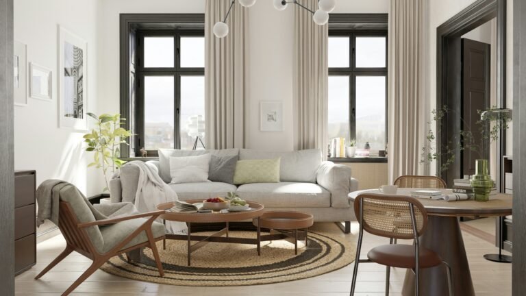
Living Room
The living room is where cozy living room colors really shine. A backdrop of taupe or sage walls sets a soothing tone, while terracotta accents add warmth. If you want a grounded yet airy space, layer textiles such as wool throws, linen curtains, and plush area rugs in sandy neutrals.
Designers often recommend pairing earth tones with natural elements like rattan, reclaimed wood, or indoor plants. According to Livingetc, earthy palettes gain depth when combined with organic textures like woven fibers and ceramics.
Personally, I love how a soft terracotta accent wall anchors a living room. When paired with a jute rug and leafy greenery, it creates a space that feels both elevated and inviting.
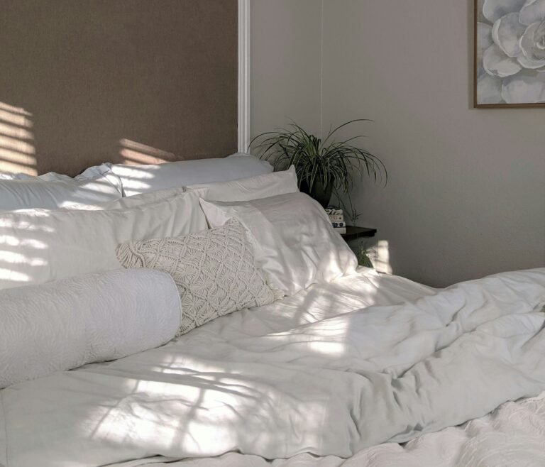
Bedroom
Earth tones work beautifully in bedrooms because they encourage rest and relaxation. Warm neutrals like beige, burnt orange, or honey tones create a cocooning effect, especially when paired with layered textiles.
The Spruce highlights earthy bedrooms as one of 2025’s strongest design trends, with designers leaning into clay, taupe, and muted rust for a tranquil retreat.
Some styling ideas include:
- Linen bedding in sandy hues topped with a rust or clay throw.
- Dark wood furniture for grounding.
- Limewash or plaster walls in soft taupe for subtle depth.
From my own projects, I’ve found that introducing olive or sage green accents in cushions or wall art adds a fresh, calming layer without disrupting the warmth of the room.
Kitchen and Dining
The kitchen and dining areas are perfect places to experiment with nature inspired palettes. Shades like olive green, golden ochre, and chocolate brown evoke richness and appetite while maintaining a natural feel.
For cabinetry, muted olive or clay tones are becoming popular alternatives to white or gray. Pairing them with natural stone countertops and wood accents creates a balance of rustic charm and modern sophistication. Homes & Gardens suggests that rich autumnal palettes like ochre and rust are especially impactful in dining rooms, where they encourage a sense of comfort and hospitality.
I often recommend incorporating earthy ceramics and woven placemats at the dining table. These small details reinforce the palette while making the space feel grounded and lived-in.
Bathroom and Entryways
Bathrooms benefit from spa-like tranquility, making them ideal for soft sandy neutrals, warm taupes, and pale stone-inspired shades. According to Elle Decor, earth tone colors can transform even small bathrooms into restful sanctuaries by adding warmth where cool whites would feel sterile.
For entryways, a clay or ochre accent wall creates an immediate sense of welcome. Layering in woven baskets, rustic mirrors, and a warm runner rug enhances the earthy aesthetic while also being practical.
I’ve found that entryways are the perfect spot to experiment with deeper shades like chocolate brown or rust, since these smaller spaces benefit from bold impact without overwhelming the home.
By styling each room intentionally, earth tone colors can create a cohesive flow throughout your home while still allowing for variation and personality in each space.
Lighting, Materials and Texture
When it comes to earth tone styling, color alone isn’t enough. The way light interacts with your palette, and the textures and materials you choose, determine whether the space feels flat or full of life.
The Role of Lighting
Earth tones thrive under warm, layered lighting. A single overhead bulb can wash out the richness of terracotta or taupe, while a mix of floor lamps, sconces, and table lamps creates depth. Whispering Bold notes that warmer bulbs paired with dimmers help earth tones reveal their natural glow, especially in the evenings.
From my own experience, I find that placing a lamp near a clay-colored wall brings out subtle undertones you might not notice in daylight. It’s a small change that transforms the room’s mood.
Choosing Natural Materials
Materials are just as important as color when creating an earthy home. Woods like oak, walnut, and ash introduce organic warmth. Stone and terracotta tiles add tactile richness. Woven elements such as rattan, seagrass, or jute complement the natural palette beautifully (Yanko Design).
For a modern take, balance raw materials with sleek finishes. For instance, a rustic wood dining table paired with matte black accents feels grounded yet contemporary.
Layering Texture for Depth
Texture prevents neutral palettes from feeling bland. Think boucle cushions, linen curtains, ceramic vases, or meadow-grass arrangements. Livingetc suggests that texture-heavy combinations, especially in shades of rust and clay, create warmth and character even in minimalist spaces.
I often rely on layering – adding a chunky knit throw over a linen sofa, placing a rough ceramic vase on a smooth oak surface, or contrasting plaster walls with soft fabric headboards. Each layer catches light differently, enhancing the depth of earth tone colors.
Trend Insights and Evolution
While earth tone colors are undeniably timeless, they’re also very much on-trend in 2025. Designers and homeowners alike are leaning into palettes that echo the natural world, with an emphasis on warmth, sustainability, and connection to the outdoors.
The Shift Toward Sunwashed Palettes
Recent reports highlight a move toward sunwashed earth tones like muted clay, golden sand, soft sage, and pale terracotta. These shades feel lighter and more adaptable, especially in open-plan homes where too much depth could overwhelm the space. According to Better Homes & Gardens, colors inspired by natural light and outdoor environments will dominate this year.
Biophilic Design and Sustainability
The popularity of nature inspired palettes goes hand in hand with the rise of biophilic design. This approach blends architecture and interiors with natural elements to enhance well-being. Incorporating organic hues with sustainable materials like reclaimed wood, clay plaster, or eco-friendly fabrics reflects a broader shift toward conscious living (Whispering Bold).
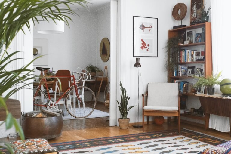
From Rustic to Refined
What’s striking is how versatile earth tones have become. They no longer belong solely to rustic or farmhouse aesthetics. Designers are integrating them into sleek, modern interiors with clean lines and contemporary finishes. A Mediterranean-inspired entryway by Joanna Gaines, for example, combines terracotta and rust shades with elegant textures, showing how adaptable these hues can be (Homes & Gardens).
From my perspective, this evolution is what makes earth tones so exciting. I’ve styled them in everything from cozy, bohemian bedrooms to streamlined city apartments. In every context, they add warmth without sacrificing sophistication.
In short, the evolution of earth tone colors reflects not only shifting design preferences but also deeper cultural values – comfort, sustainability, and authenticity.
Quick Checklist for Styling Earth Tone Rooms
Styling earth tone colors doesn’t need to feel overwhelming. Use this simple checklist to bring warmth, depth, and balance to any room:
- Choose a Base Shade – Start with a grounding neutral like sage, taupe, or sandy beige.
- Layer Complementary Tones – Add depth with variations such as clay, rust, or olive.
- Mix Natural Materials – Incorporate wood, stone, rattan, or terracotta for authentic warmth.
- Add Texture – Use linen, boucle, jute, and ceramics to keep the palette dynamic.
- Use Warm Lighting – Opt for warm-toned bulbs and layered lighting to highlight earthy hues.
- Introduce Greenery – Plants or meadow-grass arrangements tie the palette back to nature.
- Balance Contrast – Pair light neutrals with deeper accents like chocolate brown or ochre.
- Personalize – Infuse personality with artwork, throws, or small décor items in your favorite earthy shade.
Whenever I style with this checklist in mind, I find the results feel both intentional and effortless – spaces that are grounded yet welcoming.
Conclusion
Styling earth tone colors isn’t just about following a design trend, it’s about creating a home that feels warm, natural, and deeply connected to the world around us. These shades have stood the test of time because they offer something that bright or fleeting colors rarely achieve: a sense of balance, calm, and authenticity.
Whether you’re drawn to sandy neutrals, muted sage, or the richness of terracotta, the key lies in layering thoughtfully. Use natural materials, introduce texture, and choose lighting that enhances the depth of your palette. By weaving these elements together, you’ll create rooms that are not only stylish but also emotionally comforting.
From my own experience, I’ve found that once you start living with earth tones, it’s hard to imagine going back. They make spaces feel inviting in a way that few other palettes can. Every time I walk into a room styled with warm neutrals and natural textures, I feel grounded, at ease, and inspired.
If you’re ready to update your home, start small, maybe with a clay-toned throw pillow or a sage green accent wall and let the palette grow from there. You’ll soon see how these natural shades can transform every room into a haven of warmth and timeless elegance.
Frequently Asked Questions
Alex is the creator of Homely Haven, a space dedicated to simple, stylish ideas for interiors and gardens alike. With a passion for cozy living rooms, inviting outdoor spaces, and practical DIY solutions, Alex shares tips and guides that help turn any house into a true home.
From budget-friendly decorating hacks to weekend garden projects, the goal is always the same: to inspire you to create spaces that feel personal, beautiful, and welcoming. When not writing, Alex is usually rearranging furniture, sketching new garden layouts, or exploring design trends for the next project.