You’ve planted all your favourites—roses, lavender, maybe even some ornamental grasses. But something still feels… off. The colours clash, or maybe it just looks a bit flat. You scroll through photos of “dream gardens” and wonder, Why doesn’t mine look like that?
Here’s the thing: it’s not about how many plants you’ve squeezed into your borders. It’s about how those colours work together to tell a story, create a mood, and lead your eye through the space. That’s where colour theory comes in—and no, you don’t need to be an artist or a designer to use it well. Understanding color theory is essential for creating harmonious garden designs.
This guide will walk you through the basics of colour theory in garden design and show you how to use it like a pro. Whether you’re planting a few pots or planning a full-scale garden makeover, you’ll learn how to build colour schemes that feel balanced, intentional, and beautiful all year round, leveraging the principles of color theory.
What Is Colour Theory, Really?
Let’s strip away the jargon. Colour theory is just a way to understand how colours relate to each other—what works well together, what creates contrast, and what feels harmonious. It’s the same set of principles artists and interior designers use, and yes—it applies beautifully to gardens, enhancing your understanding of color theory.
At the heart of it is the colour wheel. You’ve probably seen one before: a circle showing primary colours (red, blue, yellow), secondary colours (orange, green, purple), and everything in between. The wheel helps you see relationships—like which colours sit opposite each other (complementary), which are side-by-side (analogous), and how you can group them to create a specific vibe in your garden.
So why does this matter outside with plants and dirt? Because every flower, leaf, and even stone in your garden has a colour. And when those colours work well together, your garden goes from a collection of plants to a cohesive, inviting space, thanks to the principles of color theory.
This isn’t about “rules”. It’s about giving you a framework you can lean on when you’re stuck or unsure. Once you understand the basics, you’ll start seeing colour differently—not as random choices, but as deliberate, powerful design tools.
How Colour Impacts Mood in a Garden
Colour isn’t just pretty—it feels a certain way. That’s why some gardens feel calm and relaxing, while others feel bold and energising. Whether you realise it or not, the colours you choose can completely change the mood of your outdoor space.
Here’s a quick breakdown:
- Cool colours like blues, purples, and soft greens are calming and tend to recede visually. They make a space feel larger and more tranquil—perfect for a peaceful corner or a meditative retreat.
- Warm colours like reds, oranges, and yellows are energising and tend to pop. They draw attention, create warmth, and bring a sense of excitement. Great near patios or entertaining areas.
- Neutrals like whites, greys, and greens (yes, green often acts as a neutral in gardens) help balance everything out. They let brighter colours shine or act as a soft backdrop when you want a more natural, understated feel.
Think about what you want your garden to feel like. A quiet escape? A lively social space? Something playful and whimsical? Once you’ve got a mood in mind, you can start building a colour scheme to match.
And remember—plants don’t just bring colour through flowers. Foliage, bark, stems, and even fruit add layers of colour that influence the overall vibe.
The Colour Wheel for Gardeners
Think of the colour wheel as your garden design cheat sheet. It helps you make sense of what colours work well together—and why. Here’s how to read it with a gardener’s eye:
Primary Colours
These are the foundation: red, blue, and yellow. You can’t mix them from other colours, but they’re the building blocks for everything else. Many flowers and foliage plants use these colours to stand out.
Secondary Colours
These are created by mixing two primaries:
- Red + yellow = orange
- Blue + yellow = green
- Red + blue = purple
Tertiary Colours
These sit between primary and secondary colours (like red-orange or blue-green). They add nuance and are often seen in flowers with more complex shades.
Key Colour Relationships
- Complementary: Colours opposite each other on the wheel (e.g. purple and yellow). These create strong contrast and drama. Use sparingly for a punchy effect.
- Analogous: Colours next to each other (e.g. blue, blue-green, green). These feel harmonious and soothing—perfect for a more natural, flowing look.
- Monochromatic: Variations of a single colour. This can look sophisticated and calming, especially when you play with texture and form.
- Triadic: Three colours spaced evenly around the wheel (e.g. red, yellow, blue). This can be vibrant but balanced—great for bold gardeners who love a mix.
A quick tip: when in doubt, green—which is everywhere in a garden—acts like a neutral. It gives you freedom to play with other colours without overwhelming the space.
Popular Colour Schemes in Garden Design
Now that you’ve got a feel for how the colour wheel works, let’s look at some real-world ways gardeners use it to create intentional, striking spaces. These schemes aren’t rules—they’re starting points that help you find your style and build confidence.
1. Monochromatic
Stick to one colour, but vary the tones. Think deep burgundy tulips, dusty pink roses, and pale pink cosmos. Monochromatic schemes feel calm, unified, and often quite elegant. Bonus: they’re hard to mess up.
Good for: formal gardens, modern spaces, soothing retreats.
2. Complementary
Use colours opposite each other on the wheel, like purple and yellow or red and green. This creates high contrast and energy. It’s bold and eye-catching, but too much can feel jarring—use one as the star and the other as an accent.
Good for: focal points, container gardens, lively entertaining areas.
3. Analogous
Pick colours that sit next to each other—like blue, blue-purple, and purple. This creates a soft, blended look that feels natural and relaxed. It’s especially effective when layered with foliage and texture.
Good for: cottage gardens, borders, wildflower meadows.
4. Triadic
Use three colours equally spaced around the wheel, such as red, yellow, and blue. It’s bold, balanced, and playful—but it needs a careful hand. Stick to one or two dominant colours and let the third pop in small doses.
Good for: statement gardens, eclectic styles, family spaces.
5. Neutral with a Pop
Use mostly greens, whites, silvers, and natural tones—then add one bold colour (like fiery red or electric blue) for contrast. It’s a safe, stylish way to experiment without overwhelming the space.
Good for: small gardens, minimalist designs, modern patios.
These schemes aren’t set in stone, and the best gardens often mix and evolve. But knowing these combinations gives you a solid base to build from—so your garden feels pulled together, not thrown together.
How to Build a Colour Palette for Your Garden
You don’t need to be a designer to build a beautiful palette—you just need a starting point and a few smart choices. Here’s a simple step-by-step process to help you put theory into action:
1. Start with a Mood
Ask yourself: What do I want my garden to feel like? Calm, dramatic, romantic, playful? Let that guide your palette. Soft pastels for a peaceful vibe. Deep jewel tones for something more theatrical. Bright primaries if you want energy and joy.
2. Pick a Base Colour
Choose one dominant colour to lead the way. This might be your favourite flower, a plant you already love, or something that complements your house or surroundings.
Example: If you love lavender, that soft purple could be your anchor.
3. Add Supporting Colours
Use the colour wheel to find two or three supporting shades that either:
- Complement your base (opposites attract),
- Sit next to it (analogous), or
- Offer contrast through foliage and texture.
Example: Lavender pairs well with silvery foliage, soft pinks, and maybe a splash of yellow for contrast.
4. Work in Neutrals
Every good palette needs space to breathe. Greens, whites, greys, and even earthy browns help balance bolder colours and make transitions feel smooth.
5. Consider Seasonal Shifts
Some plants bloom for just a few weeks. Think about what colours will show up in spring, summer, autumn, and even winter. Try to choose a mix that offers interest across multiple seasons.
6. Test in Small Areas First
Not sure how it will look? Try it in a container or small border. See how the colours work together in different lights and over time.
You don’t need to plan everything perfectly. But with a rough palette in mind, your garden will feel intentional, not accidental—and that’s what makes it look professionally designed.
Seasonality & Colour
Colour in the garden isn’t static—it shifts with the seasons. That’s both the challenge and the magic. If you want a garden that looks good all year, you’ve got to think beyond just flowers.
Spring: Fresh and Uplifting
This is when soft pastels shine. Think pale yellows, lilacs, baby blues, and blush pinks. Pair them with fresh green foliage for a clean, hopeful vibe.
Tip: Bulbs like daffodils, tulips, and hyacinths are great for early spring colour bursts.
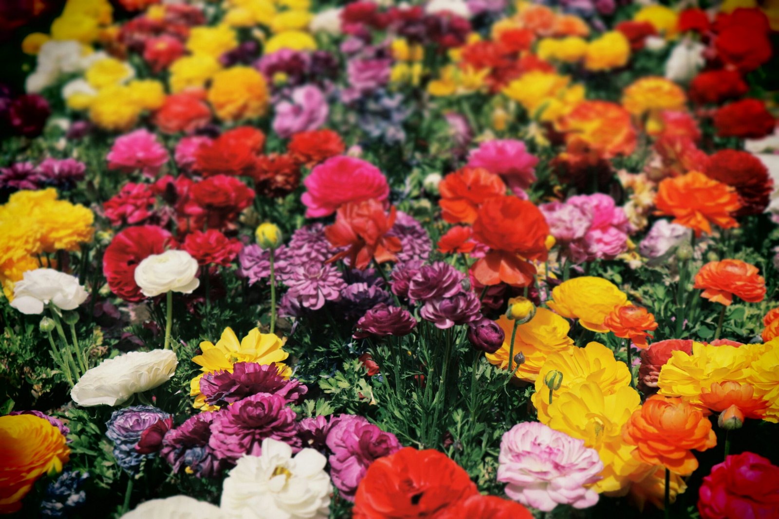
Summer: Bold and Abundant
Summer brings the heat—and with it, saturated colours. Rich reds, deep purples, hot pinks, oranges, and bright yellows dominate. These colours are perfect for energising social spaces or drawing attention to focal points.
Tip: Add ornamental grasses or silver foliage to balance the intensity.
Autumn: Warm and Earthy
Think russet, burnt orange, burgundy, and gold. This is when foliage takes the spotlight. Many perennials and shrubs offer stunning autumn colour as flowers fade.
Tip: Use autumn colour to echo the tones of brick, wood, or rusted metal in your garden.
Winter: Subtle and Structural
Winter gardens don’t have to be dull. This is where evergreens, bark textures, and structure do the heavy lifting. Use dark greens, whites, and touches of red from berries or stems.
Tip: Think in layers—evergreens at the back, winter-flowering hellebores or snowdrops at the front.
By planning for seasonal colour shifts, your garden stays interesting year-round. It’s not just about having something blooming—it’s about maintaining balance, texture, and harmony no matter the month.
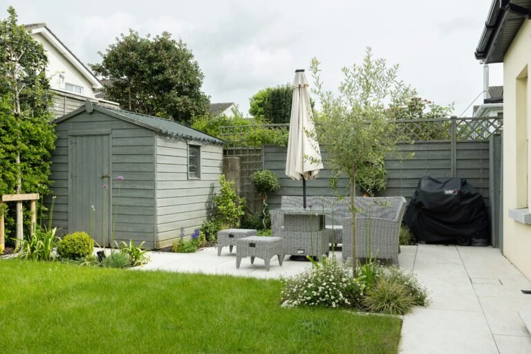
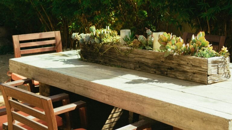
Hardscaping, Furniture & Accessories
Colour theory isn’t just for plants—your paths, fences, pots, and even furniture play a huge role in how your garden looks and feels. In fact, these non-living elements often set the tone and hold the design together when the plants aren’t in bloom.
Hardscaping Sets the Foundation
Materials like stone, brick, gravel, and timber introduce earthy tones—greys, beiges, reds, and browns. These can act as warm or cool backdrops, depending on the mood you want.
Tip: Cool-toned materials like slate or concrete pair beautifully with blues and purples. Warm bricks or sandstone work well with oranges, reds, and yellows.
Furniture & Decor Add Personality
Outdoor furniture and decor offer a chance to reinforce or contrast your palette. A bright yellow bench in a green space can act as a focal point. Soft grey cushions on a patio blend in and create calm.
Tip: Choose colours that either echo your planting scheme or add deliberate contrast. Repeating colours from your flower beds in furniture or accessories ties everything together.
Pots, Planters & Structures
Terracotta pots naturally lean warm, while glazed ceramics or painted planters can swing any way. Trellises, arches, pergolas—these can be painted or stained to complement your overall colour story.
Tip: If your garden is small or paved, your pots might be your main colour anchors. Choose a set palette and repeat it to keep things cohesive.
When these non-plant elements are chosen with colour in mind, they elevate your whole design. They fill in the gaps between seasons and give your garden depth, structure, and polish.
Common Mistakes & How to Avoid Them
Even with the best intentions, it’s easy to go off track with colour in your garden. Here are some of the most common pitfalls—and how to avoid them:
1. Too Many Colours Competing
It’s tempting to plant every flower you love. But without a plan, this often leads to a chaotic, clashing garden that lacks flow.
Fix it: Stick to a limited palette—three or four main colours max—and repeat them throughout the space to create unity.
2. No Focal Points
Without contrast or structure, everything blends in. You need highlights and anchors to guide the eye.
Fix it: Use bold colours or larger plants to draw attention where you want it. Complementary colours work well for focal points.
3. Ignoring the Background
People often forget that fences, walls, and paving affect how plant colours look. A bright flower can get lost against a similar-toned background.
Fix it: Use contrast—dark blooms pop against light walls, and vice versa. Repaint or restain where needed to support your palette.
4. Seasonal Imbalance
Many gardens are designed for summer and feel empty the rest of the year.
Fix it: Mix in evergreens, interesting foliage, and plants with multi-season appeal (like colourful stems or berries). Think in layers, not just blooms.
5. Over-reliance on Flowers
Colour doesn’t just come from blooms—and relying only on flowers can make your garden feel bare when they’re not in season.
Fix it: Use coloured foliage, textured bark, and accessories to add visual interest year-round.
Mistakes are part of learning—but knowing what to look out for helps you build a garden that feels intentional, not accidental.
Final Tips: Mixing Passion with Principles
Designing with colour doesn’t mean you have to follow rigid rules. The best gardens come from a mix of what you love and what works. Colour theory just helps you connect the dots.
Here are a few parting tips to keep in mind:
1. Let Your Favourite Colour Lead the Way
Don’t fight your instincts—if there’s a colour you adore, build around it. Use the colour wheel to find shades that enhance it, not clash with it.
2. Repeat Colours to Create Flow
Repetition is what pulls a garden together. If you use purple in one corner, echo it in another spot across the garden. It builds cohesion and leads the eye.
3. Play with Texture and Form
A limited colour palette doesn’t have to be boring. Use different leaf shapes, flower forms, and plant heights to add variety and movement.
4. Take Photos and Revisit
Colours can look different at different times of day, in different weather, or from different angles. Snap a few photos, step back, and reflect before planting something permanent.
5. Break the “Rules” When It Feels Right
At the end of the day, it’s your garden. If something makes you smile—even if it doesn’t fit the textbook definition of harmony—go for it.
Colour theory gives you a strong foundation. But passion, creativity, and a willingness to experiment are what make your garden truly yours. Use the principles, trust your instincts, and you’ll design a space that doesn’t just look good—it feels like home.
Alex is the creator of Homely Haven, a space dedicated to simple, stylish ideas for interiors and gardens alike. With a passion for cozy living rooms, inviting outdoor spaces, and practical DIY solutions, Alex shares tips and guides that help turn any house into a true home.
From budget-friendly decorating hacks to weekend garden projects, the goal is always the same: to inspire you to create spaces that feel personal, beautiful, and welcoming. When not writing, Alex is usually rearranging furniture, sketching new garden layouts, or exploring design trends for the next project.