I’ve always believed that the bedroom should be more than just a place to sleep, it should be a sanctuary where you can truly unwind. For a long time, I thought bold bedroom colors would make a space feel overwhelming, maybe even chaotic. But when I painted my own room a deep emerald green with touches of muted gold, I realized something surprising: bold hues can actually create calm, not conflict.
When chosen with care, bold bedroom colors can transform your room into a calm and stylish space. Instead of settling for the predictable beige or white, you can lean into rich tones that ground you emotionally while still reflecting personality and style. In this guide, we’ll explore how color psychology works in the bedroom, why bold shades can be surprisingly restful, and practical design strategies to balance vibrancy with serenity.
By the end, you’ll have both the confidence and inspiration to bring bold color into your bedroom, without sacrificing calm.
Why Bold Bedroom Colors Can Be Surprisingly Calming
Bold colors often get a reputation for being loud, energizing, or even distracting. In many cases, people associate saturated hues with stimulation rather than relaxation. But when used thoughtfully, bold tones can actually enhance a sense of tranquility and comfort in the bedroom.
The secret lies in balance. Deep shades like emerald green, inky blue, or rich plum don’t need to dominate every wall to make an impact. Instead, they can serve as grounding elements that frame the room and create a cocoon-like atmosphere. According to Homes & Gardens, bold colors layered with softer tones and natural materials can still feel soothing, even in smaller bedrooms.
Recent trend reports highlight that bold doesn’t always mean bright. Architectural Digest points to color drenching where a single rich shade covers walls, trim, and even ceilings as a rising interior design trend that fosters a sense of immersive calm. When executed in deep hues, this technique turns the bedroom into a cozy retreat rather than a stimulating space.
From my own experience, the calmness of bold color comes alive in the evening, under warm lighting. What feels dramatic during the day often softens into comfort at night.
Understanding Color Psychology
Color psychology plays a powerful role in shaping how we feel within a space. While neutrals like white and beige are often considered safe choices for relaxation, research shows that certain bold hues can also contribute to a restful state of mind when applied thoughtfully.
Blue, for instance, has been linked to lowering heart rate and blood pressure, making it one of the most calming colors for sleep. Studies referenced by Calm note that blue is particularly effective for fostering restful nights.
Green is another excellent option. As the color most associated with nature, it brings feelings of renewal and peace. Sherwin-Williams highlights how green can balance boldness with serenity, especially in darker shades like forest or emerald.
Purple, particularly in muted tones like lavender or plum, has long been tied to luxury and calm. Interestingly, actress Emma Watson’s own bedroom design has drawn attention for its use of purple patterns that feel both stylish and soothing.
Meanwhile, neutral shades like soft grays, creamy whites, warm taupes are essential for balance. They prevent bold colors from becoming overwhelming and create space for the eye to rest, as noted by Everything Home Designs.
The takeaway? Bold bedroom colors can be calming when they tap into psychology-backed associations and are layered with lighter tones to keep the mood harmonious.
Choosing Your Bold Palette for Calm
Selecting the right palette is the foundation of creating a bedroom that feels bold yet serene. Not all strong shades are equal in their emotional impact, so it’s important to choose colors that balance personality with tranquility.
Emerald or Deep Green
Greens rooted in nature bring a strong sense of stability. A bold emerald wall paired with wood tones or linen bedding creates a cocoon-like calm. Homes & Gardens frequently showcases green as a timeless choice for bedrooms that balance drama with peace.
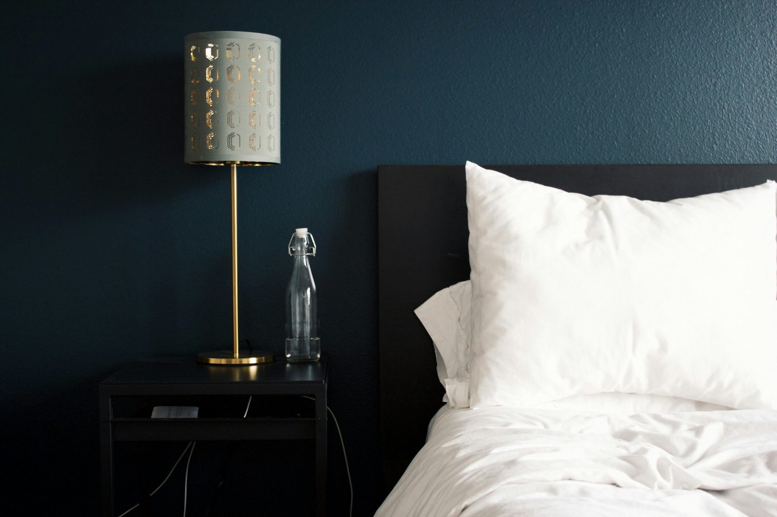
Inky Blue or Teal
Dark blues and teals are powerful but not overpowering. They can mimic the night sky, which naturally signals the body to wind down. Sleep.com notes that these hues are particularly effective in bedrooms designed for rest.
Rich Plum or Purple Accents
Plum and purple are both bold and soothing, especially in muted or patterned applications. Emma Watson’s bedroom design, which integrates purple fabrics and subtle patterns, is an example of how luxurious bold tones can remain calming.
Butter Yellow or Peach Accents
While yellow is often considered stimulating, softer tones such as butter yellow or muted peach can uplift a room without overwhelming it. Interior experts highlighted by Ideal Home suggest these lighter bold shades as perfect for brightening dark spaces while keeping the atmosphere gentle.
I tried painting a single wall in my guest bedroom a deep teal and paired it with crisp white sheets and warm lighting. The result surprised me, it felt inviting, restful, and unexpectedly cozy.
Design Techniques That Support Serenity
Choosing bold colors is only half the story. The way you apply and balance them in the room determines whether the result feels calming or chaotic. Here are proven design strategies that help bold bedroom colors work in your favor.
Accent Walls and Color Blocking
Painting a single wall in a bold shade can make a statement without overwhelming the space. Color blocking like using bold colors in structured shapes or panels adds interest while keeping the room grounded. Architectural Digest highlights this as part of the color drenching trend, where designers use bold applications to create depth and atmosphere.
Layer with Soft Textures
Strong wall colors pair beautifully with tactile materials. Linen curtains, velvet cushions, or grass-cloth wallpaper soften the impact of saturated hues. Sleep.com notes that texture is essential for balancing color and creating comfort.
Strategic Lighting
Lighting determines how bold colors appear at different times of the day. Warm bulbs and dimmers reduce harshness, making even strong hues feel soothing. Emma Watson’s bedroom, with purple accents softened under gentle light, is a perfect example.
Complementary Accents
Furniture and decor choices can tone down bold shades. Neutral bedding, natural wood, or metallic highlights help balance vibrancy. Better Homes & Gardens suggests painted furniture in coordinating shades to tie a scheme together without overpowering the room.
Natural Inspiration
Drawing from the outdoors is a timeless way to create harmony. Pairing moss green walls with earthy pinks or muted browns mirrors biophilic design principles. Ideal Home points out that color combinations inspired by nature tend to feel restorative and grounding.
From my own experience, it wasn’t the bold paint alone that created calm in my bedroom, it was the combination of textures, lighting, and accents that transformed the space into a sanctuary.
Practical Steps to Apply Bold Colors Calmly
Knowing what works in theory is one thing, but translating bold color choices into a calming real-life bedroom requires a step-by-step approach. These practical actions will help you bring vibrancy and serenity together.
Step 1: Choose Your Dominant Bold Color
Select one main bold shade to anchor the room like emerald green, deep teal, or rich plum. This prevents the space from feeling cluttered with competing colors.
Step 2: Test Swatches Under Different Lighting
Paint small sections and observe them in both daylight and evening light. Colors often shift dramatically depending on natural and artificial lighting, which can change the entire mood of the room.
Step 3: Select Supporting Neutrals
Pair your bold color with soft whites, warm grays, or natural beige tones. According to Everything Home Designs, neutrals provide resting points for the eye and prevent bold tones from becoming overwhelming.
Step 4: Decide on Coverage
You don’t need to commit to all four walls. A single accent wall, alcove, or even a painted headboard can deliver the drama without overpowering. House Beautiful notes that partial applications of bold color often create the most stylish and calming results.
Step 5: Layer Textures and Accessories
Add bedding, curtains, and cushions in complementary materials. Linen, cotton, and velvet all help soften strong hues and make the room more inviting.
Step 6: Reflect on Mood
After arranging colors and decor, take time to sit in the room. Ask yourself: does it feel calm, balanced, and stylish? Adjust lighting, add neutrals, or scale back bold accents if needed.
Sample Pairings for Inspiration
- Emerald Green + Warm Beige + Linen Textures → Sophisticated and restful.
- Deep Teal + Light Gray + Gold Accents → Elegant with a calming glow.
- Soft Lavender Pattern + Cream Walls + Muted Gray Bedding → Romantic calm with visual depth.
- Butter Yellow Accent + Neutral Walls + Natural Wood Pieces → Uplifting yet serene.
When I tested swatches in my own room, I was surprised by how much softer teal appeared under warm lamplight compared to bright daylight. That simple test made all the difference in deciding how much of the color to use.
Final Touches and Maintenance
Even after you’ve chosen your bold palette and applied it thoughtfully, the finishing details determine whether your bedroom feels truly calm and stylish. Small adjustments and ongoing care will keep your design fresh and serene over time.
Pay Attention to Color Names
Believe it or not, the name of a shade influences how we perceive it. A paint labeled “Velvet Sage” sounds far more soothing than one called “Flat Green.” Marketing aside, these names often hint at undertones, helping you select shades that support a calming mood.
Refresh with Textiles Before Repainting
Sometimes you don’t need a new coat of paint to revive a bold scheme. Swapping out curtains, bedding, or throw pillows in the same palette can freshen the look without major effort. Better Homes & Gardens suggests experimenting with painted furniture and fabric accents as an easy update strategy.
Keep Lighting in Check
Lighting is one of the easiest ways to maintain calm in a boldly colored room. Replace bulbs regularly, clean fixtures, and consider warm-toned LED options. These subtle adjustments ensure that your bold colors remain soft and soothing rather than harsh.
Use Seasonal Accessories
Rotating artwork, rugs, or accent decor seasonally keeps a bold room dynamic without repainting. For instance, pairing emerald walls with light rattan accents in summer and velvet cushions in winter creates year-round balance.
From my own routine, I’ve learned that refreshing bedding twice a year and switching out bedside lampshades keeps my bold teal bedroom feeling both current and calming without the need for constant repainting.
Conclusion
Bold bedroom colors don’t have to be intimidating. When chosen and applied with care, they can transform your bedroom into a calm and stylish sanctuary. Deep greens, inky blues, rich plums, and even soft yellows can bring depth and character while still fostering rest. The key lies in balance, pairing bold tones with supportive neutrals, layering textures, and softening the atmosphere with thoughtful lighting.
In my own experience, experimenting with bold color was less about following rules and more about trusting how a space made me feel. A teal accent wall, combined with warm wood and linen textures, turned my bedroom into a place I look forward to retreating to at the end of the day.
So, if you’ve been hesitant, take the leap. With the right palette and design strategies, bold bedroom colors can help you craft a bedroom that feels both vibrant and deeply restful.
Frequently Asked Questions about Bold Bedroom Colors
Alex is the creator of Homely Haven, a space dedicated to simple, stylish ideas for interiors and gardens alike. With a passion for cozy living rooms, inviting outdoor spaces, and practical DIY solutions, Alex shares tips and guides that help turn any house into a true home.
From budget-friendly decorating hacks to weekend garden projects, the goal is always the same: to inspire you to create spaces that feel personal, beautiful, and welcoming. When not writing, Alex is usually rearranging furniture, sketching new garden layouts, or exploring design trends for the next project.