You love the idea of florals, but something’s holding you back. Maybe you’ve got a cushion in your online basket right now — leafy and elegant, but you’re hovering on the checkout button thinking: Will this make my space look dated?
Sound familiar?
You’re not alone. Floral fabrics have a reputation. Some think they’re too girly, too fussy, or too reminiscent of their nan’s living room in 1983. But here’s the truth: florals never actually went out of style — they just evolved. And when you know how to use them right, they can bring softness, charm, and timeless detail into even the most minimalist spaces.
This article will show you exactly how to make that happen. You’ll get simple, no-fluff advice on where to use floral fabrics, how to balance them with modern touches, and how to avoid that dreaded overdone look. Whether you’re into bold botanicals or soft vintage chintz, you’ll walk away knowing how to make florals feel fresh, not fussy.
Why Florals Still Work in 2025
Florals aren’t a trend — they’re a design constant. The patterns might shift with the decades, but the appeal stays the same: nature indoors, soft textures, and a sense of comfort that hard edges and neutral tones just can’t provide.
Here’s the key: modern floral fabrics are nothing like the heavy curtains and matching sofa sets you might remember from older homes. Today’s florals come in pared-back palettes, abstract interpretations, oversized prints, and even monochrome designs. They’re versatile. They work across styles — from Scandi to boho, cottagecore to minimalist — and they add visual interest without overpowering a room.
More importantly, they help break the boxy, angular look that so many modern interiors fall into. All grey everything? Add a moss-green floral cushion. Clean lines and metal finishes? Try a soft, painterly floral on a hallway bench or bedroom blind.
Floral patterns can be bold or understated, classic or playful. And when used right, they bring warmth and life — without taking over.
Where to Use Floral Fabrics (and Where to Avoid Them)
Florals can live almost anywhere — but that doesn’t mean they should.
Start with accents. Cushions, lampshades, and curtains are the easiest way to bring floral fabrics into your space. They add a quick hit of personality without demanding a full redesign. A couple of floral scatter cushions on a plain sofa? Instant uplift. A floral blind in a neutral kitchen? Adds charm without clutter.
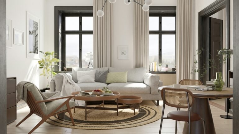
Upholstery is your power move. An armchair or ottoman covered in a bold floral can turn into a statement piece. The trick? Let it be the star. Surround it with solids or subtle textures so it feels intentional, not chaotic.
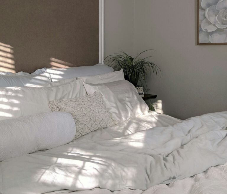
Bedrooms are a sweet spot. Floral bedding, headboards, or even a delicate bedskirt can make a room feel soft and restful. Stick to calmer palettes — like dusky blues, olive greens, or muted pinks — to keep it grown-up and serene.
Where should you be careful?
- Full-length sofas in florals can be overwhelming unless the print is extremely muted or the room is very large.
- Wall-to-wall florals (like matching curtains, cushions, and upholstery) can easily tip into overkill unless you’re going for a maximalist look — and know exactly how to control it.
- Small spaces with large floral prints can feel crowded if the print isn’t balanced out with light and negative space.
Think of florals as seasoning — not the whole dish. Used with purpose, they can add just enough flavour to elevate your space.
Classic Meets Contemporary: Choosing the Right Floral Prints
Florals don’t have to feel vintage — unless you want them to. The trick to getting that clean, contemporary look lies in how the floral is designed and what it’s paired with.
Here’s what to look for:
1. Scale matters
Large-scale florals feel modern. Think big blooms with space to breathe rather than tiny, tightly packed ditsy prints. They create more impact and feel less fussy — especially when used on single pieces like cushions, wall panels, or statement chairs.
2. Go easy on colour
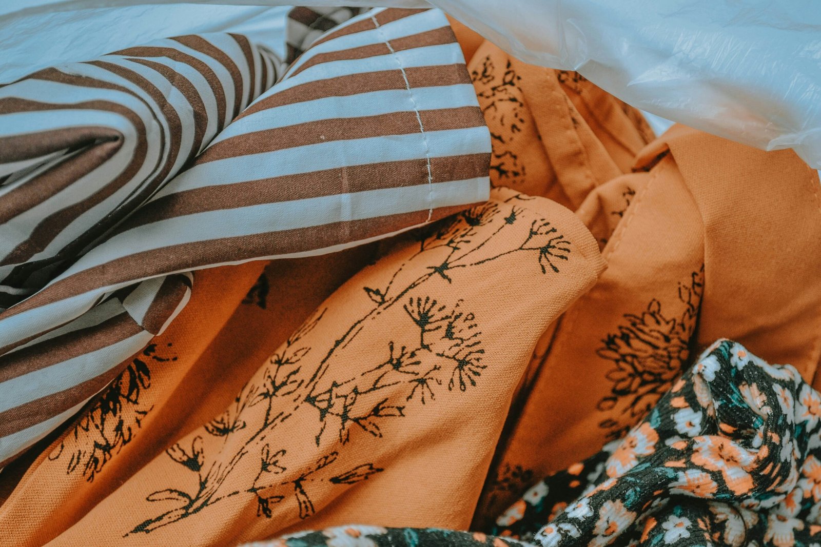
Bold patterns in neutral or muted colour palettes (think navy and cream, sage and beige, rust and blush) feel far more current than the rainbow-hued florals of decades past. Stick to a maximum of 2–3 colours per pattern if you’re worried about clashing with other elements in the room.
3. Consider the style of the print
- Watercolour florals feel soft and elegant — great for bedrooms or calming spaces.
- Botanical illustrations work beautifully in modern-rustic homes or paired with mid-century furniture.
- Abstract or stylised florals (think line drawings or geometric petals) fit well with minimalist and contemporary spaces.
4. Use modern materials
Even a traditional floral print can feel fresh when printed on linen-look cotton, boucle, or velvet. Texture can shift a fabric from old-fashioned to luxe.
5. Watch the furniture shape
Pair floral fabrics with clean-lined furniture. A sleek armchair upholstered in floral fabric feels far more modern than a tufted, ruffled one — even if the print is the same. Shape balances pattern.
The 80/20 Rule — Balancing Florals in a Room
Here’s your golden rule: florals should never be the majority voice in a room — they should be the accent that adds depth.
Think of it like this:
80% of your room should be made up of solids, neutrals, or subtle textures — your sofa, your walls, your flooring, your larger pieces. These set the tone.
20% is your play space — and this is where florals come in. This could mean one or two cushions, a blind, or a single upholstered chair. That 20% can still make a big impact — because it draws the eye without overwhelming it.
Why this works:
- It keeps the room feeling grounded.
- It stops patterns from competing with each other.
- It creates contrast, which makes the florals pop instead of blend in or clash.
You’re not aiming for a “floral room.” You’re aiming for a balanced space where floral fabric adds energy, softness or detail — depending on how you use it.
One floral piece, well chosen, does more than a room full of mismatched blooms.
Mixing Florals with Other Patterns
Yes, you can mix florals with other prints — and no, your room won’t look like a fabric shop exploded.
Pattern mixing is all about contrast and control. Here’s how to do it right:
1. Vary the scale
Don’t pair a small floral with another small print — they’ll fight for attention. Instead, balance a large floral with a thin stripe, a chunky check, or a wide geometric. The contrast in scale gives each pattern space to breathe.
2. Stick to a cohesive colour palette
Keep all your patterns within a similar colour family. For example, if your floral has navy, blush and cream, you can safely pair it with a navy stripe or blush gingham. The eye reads it as connected — even if the prints are different.
3. Use solids to break it up
Don’t go pattern-on-pattern-on-pattern with nothing in between. Use plain fabrics as a buffer — a neutral sofa between floral and striped cushions, or a solid rug under a patterned armchair. It calms the overall look and keeps it polished.
4. Pick a lead print
Your floral is probably the star. Let it set the tone, then add one or two supporting patterns that echo its style or colours. If everything’s loud, nothing stands out.
5. Trust your gut
Sometimes the mix that shouldn’t work actually does. If it feels cohesive to you, and the colours flow, you’re probably on the right track. Design isn’t paint-by-numbers — it’s about balance and intention.
Quick Dos and Don’ts
✅ DO:
- Start small. Cushions, lampshades, or a single chair are great entry points.
- Go for balance. Use florals as accents, not the whole story — stick to the 80/20 rule.
- Choose updated prints. Look for modern colour palettes, larger scales, and cleaner designs.
- Pair with structure. Clean-lined furniture and contemporary materials keep things fresh.
- Mix with care. Vary scale, unify colours, and give patterns room to breathe.
❌ DON’T:
- Overmatch. Avoid using the same floral print across curtains, cushions and upholstery.
- Overwhelm small spaces. Stick to airy prints or use florals sparingly in tight rooms.
- Ignore context. A romantic floral might look odd in a starkly industrial room — blend styles thoughtfully.
- Forget the buffer. Solids and neutrals are your best friend when mixing patterns.
Floral fabrics don’t need to dominate your space to make an impact — they just need to be used with intention.
Final Thoughts: Florals, But Make Them Modern
Florals aren’t off-limits — they just need a little editing.
Whether you love vintage charm or lean into a minimalist vibe, floral fabrics can add the softness, colour, and personality your space is missing. The key is knowing where to use them, how to balance them, and which patterns still feel current.
Start small, stay intentional, and trust your taste. You don’t need to fill your home with blooms — just a few well-placed petals can completely shift the mood.
Now, go give your space a little life.
Alex is the creator of Homely Haven, a space dedicated to simple, stylish ideas for interiors and gardens alike. With a passion for cozy living rooms, inviting outdoor spaces, and practical DIY solutions, Alex shares tips and guides that help turn any house into a true home.
From budget-friendly decorating hacks to weekend garden projects, the goal is always the same: to inspire you to create spaces that feel personal, beautiful, and welcoming. When not writing, Alex is usually rearranging furniture, sketching new garden layouts, or exploring design trends for the next project.