Stop me if you’ve heard this one before:
You’re scrolling through Pinterest, saving every moody navy living room and every mustard-accented reading nook you see. You’ve got a colour card from Farrow & Ball in one hand, a cup of tea in the other, and you’re thinking—how do I actually pull this off without it looking like a museum or my nan’s front parlour?
You’re not alone.
There’s a quiet confidence to British interiors—rich colours, layered textures, a sense of history that doesn’t try too hard. It’s cosy but elegant, bold but somehow restrained. And if you’ve ever wondered how to pair deep navy with ochre, or whether burgundy belongs in a hallway (spoiler: it does), you’re in the right place.
This guide gives you exactly what you need: a practical look at timeless British colour combinations—why they work, how to use them, and how to make them feel fresh.
Whether you’re decorating a Georgian terrace or just want to bring some depth and warmth into a new-build flat, you’ll walk away with palette ideas, style tips, and the confidence to start painting.
Why British Colour Combinations Feel So Timeless
There’s a reason British interiors have become shorthand for character, warmth and lived-in charm. And a big part of that comes down to how colours are used—not just which colours, but the way they’re layered, balanced, and given room to breathe.
In classic British homes, colour isn’t about showing off. It’s about storytelling.
Think old country estates with libraries painted deep navy, Victorian townhouses with burgundy stair runners, or Cotswold cottages with mustard accents against faded stone walls. These spaces aren’t chasing trends. They’ve evolved over time, absorbing history, personality, and practicality. That’s what makes them feel so rich—and so real.
Here’s why these colour choices stand the test of time:
- They’re rooted in heritage.
These tones—navy, burgundy, mustard, forest green—have long been part of British design. They nod to nature, tradition, and materials that age well, like leather, wool, and wood. - They’re grounded.
These colours have weight. They bring warmth and depth, which makes a room feel settled and considered—not sterile or showroom-perfect. - They mix well with textures and pattern.
British interiors often layer in checks, florals, velvets, and tweeds. Strong colour foundations give these layers something to anchor to. - They age beautifully.
Unlike stark whites or brights that can quickly date, these classic colours patina well. They don’t scream for attention. They just belong.
Timeless doesn’t mean boring. It means enduring. And British colour combinations are masters of that subtle power.
The Core Four: Navy, Mustard, Burgundy, and Forest Green
These four colours are the backbone of countless classic British interiors. They’re bold, yes—but they’re also surprisingly versatile. Used thoughtfully, they can bring warmth, depth, and personality to just about any space.
Let’s break them down:
1. Navy
Rich, steady, and endlessly adaptable.
Navy works like a neutral in British interiors. It’s dramatic enough to make a statement, but calm enough to live with every day. It pairs beautifully with brass, leather, crisp whites, and natural woods. Use it on walls for a cocooning effect, or in upholstery and cabinetry for a tailored, grounded look.
Pairs well with: mustard, cream, rust, blush, walnut wood.
Room to try it in: the living room, especially paired with velvet armchairs and soft lighting.
2. Mustard
Warm, golden, and full of character.
Mustard adds lift. It brings a slightly retro, slightly earthy energy that works particularly well as an accent. Think cushions, rugs, lampshades, or even a painted feature wall. It adds contrast without clashing, especially when paired with darker tones.
Pairs well with: navy, forest green, charcoal, tan leather, muted pinks.
Room to try it in: the kitchen—mustard bar stools or tiles can bring charm without overwhelming.
3. Burgundy
Deep, luxurious, and unmistakably British.
There’s a formality to burgundy, but it doesn’t have to feel stuffy. When balanced with natural textures or warm neutrals, it feels refined and inviting. It’s great for adding drama—on walls, rugs, or curtains—but also works beautifully in smaller doses.
Pairs well with: forest green, navy, cream, gold, dark wood.
Room to try it in: the hallway or staircase, where it can create a bold first impression.
4. Forest Green
Earthy, grounding, and quietly elegant.
Forest green connects a space to nature, which makes it feel both restful and solid. It works brilliantly with vintage furniture and botanical prints, and it can swing either classic or contemporary depending on how you style it.
Pairs well with: mustard, terracotta, soft grey, oak, brass.
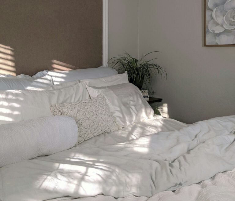
Room to try it in: the bedroom—green walls can feel calm and cocooning, especially with layered linens.
These aren’t “trendy” colours—they’re enduring favourites. And the magic happens when you start mixing them…
Mix and Match: Combinations That Just Work
Here’s where the magic starts to unfold. Each of these colours is strong on its own—but when paired thoughtfully, they create spaces that feel layered, grounded, and full of personality.
Let’s look at a few pairings that just work:
Navy + Mustard
This is a power couple.
Navy brings the calm; mustard brings the lift. Together, they create contrast that feels rich, not jarring. A navy wall with mustard velvet cushions? Classic. A mustard armchair in an otherwise navy room? Statement-making but balanced.
Where to try it: Living rooms, home offices, or even in a hallway—navy panelling with mustard paint above adds depth and drama.
Burgundy + Forest Green
It sounds intense—but it’s surprisingly elegant.
This pairing works because both colours come from nature (think autumn leaves or a country garden in full bloom). Burgundy adds warmth, green adds calm. To stop it feeling too heavy, bring in lighter neutrals like off-white, soft taupe, or natural linen.
Where to try it: Dining rooms or hallways—especially with antique furniture or brass fixtures.
Mustard + Forest Green
Playful, earthy, and a bit unexpected.
Mustard perks up green’s grounded feel, while green tones down mustard’s brightness. It’s a great combo for spaces that need both energy and warmth. This works well with botanical prints or mid-century-style furniture.
Where to try it: Kitchens, kids’ rooms, or conservatories. It’s cheerful without being over the top.
Navy + Burgundy
Moody and sophisticated.
This duo feels almost regal—but it doesn’t have to be formal. Use matte finishes, soft textures, and warm woods to keep it from feeling too buttoned-up. A burgundy sofa against navy walls? Bold and beautiful.
Where to try it: A reading nook, study, or anywhere you want a little drama.
These combinations might feel brave at first glance—but with the right balance (and maybe a few tester pots), they can completely transform your space.
Balance Is Everything
If you’re working with bold, heritage colours like navy, mustard, burgundy, and forest green, balance is what stops your space from feeling overwhelming or dated. The goal isn’t to fill every corner with colour—it’s to use it with intention.
Here’s how to strike that balance:
1. Use Neutrals as Breathing Space
Deep colours need room to shine. Offset them with warm neutrals like off-white, oatmeal, or stone grey. This creates contrast and helps your feature colours stand out without fighting for attention.
Try this: Navy walls with cream curtains and pale wood floors. Or a burgundy rug on soft neutral carpet.
2. Let Materials Do Some of the Talking
Wood, brass, linen, wool—these all carry their own colour and texture. Let them support or soften your palette. Natural oak next to mustard. A brass pendant light over forest green cabinets. These combinations bring in warmth and authenticity.
Think of it like this: Not everything needs to be painted to be part of the colour story.
3. Think in Percentages
A common stylist trick is to follow the 60-30-10 rule:
- 60% main colour (walls, large furniture)
- 30% secondary colour (accent furniture, rugs)
- 10% pop or contrast colour (cushions, art, accessories)
This keeps things feeling intentional rather than chaotic.
4. Watch the Lighting
Bold colours look different depending on the light. North-facing rooms tend to be cooler and can make navy feel almost black. South-facing rooms bring out warmth, which can make mustard glow beautifully. Always test colours in your space before committing.
5. Don’t Force It
Some colours might appeal to you in theory but not suit your space—or your mood. That’s fine. The best rooms feel like extensions of the people who live in them. If burgundy feels too heavy for your living room, maybe it belongs in the hallway or on a piece of art instead.
It’s not about rules—it’s about rhythm. And once you get the balance right, those classic colours will do what they do best: make your home feel thoughtful, layered, and entirely yours.
Making It Modern: Classic Colours, Contemporary Spaces
Classic British colour palettes aren’t just for period properties. Used right, they can feel sharp, current, and incredibly liveable—even in the most modern settings. It’s all about the styling.
Here’s how to bring these heritage tones into today’s spaces without slipping into nostalgia:
1. Choose Clean Lines and Contemporary Shapes
Bold colours feel more modern when paired with simple, uncluttered design. Think mustard on a sleek mid-century sofa, or forest green on handleless kitchen cabinetry. The colour grounds the space, while the shape keeps it feeling fresh.
Try this: Burgundy on a curved headboard in an otherwise minimalist bedroom.
2. Mix in Modern Materials
Heritage colours love contrast. Introduce elements like black metal, smoked glass, terrazzo, or concrete to add edge. These materials stop the palette from feeling too traditional and add visual tension in the best way.
Example: Navy kitchen units with a concrete worktop and matte black taps.
3. Keep the Palette Tight
Modern design thrives on restraint. Instead of using five different shades, pick two or three and repeat them in different ways across the space—walls, soft furnishings, artwork, accents. This gives cohesion and clarity.
Think of it as: Telling a colour story, not shouting over one another.
4. Use Negative Space Intentionally
White or pale neutrals aren’t the enemy here—they can help these richer colours pop. A mustard chair against a white wall feels crisp and modern. A navy feature wall framed by bare floorboards feels purposeful, not heavy.
5. Add a Twist with Unexpected Pairings
Burgundy with blush pink. Forest green with pale aqua. These aren’t strictly “traditional,” but they work—because they nod to the old while introducing something new. Don’t be afraid to play.
Classic colour doesn’t mean dated. In fact, when you bring it into the present with clean design and smart contrast, it becomes something else entirely: timeless, but with a twist.
Room-by-Room Inspiration
Sometimes it helps to see how these colour combinations come to life in specific spaces. Here’s a room-by-room look at how you can use navy, mustard, burgundy, and forest green to shape atmosphere, mood, and style—without overthinking it.
Living Room: Navy & Mustard with Warm Wood
Go for navy walls to create a cocooning feel, then lift the space with mustard accents—a velvet armchair, patterned cushions, or even a vintage rug. Add warm wood furniture and aged brass lighting for balance.
Feels like: Cosy, grown-up, and quietly confident.
Kitchen: Forest Green & Brass with Creamy Neutrals
Paint the lower cabinets forest green and keep the upper half light—think warm cream or soft grey. Add brass handles and natural stone or timber worktops for contrast. It’s earthy but elevated.
Feels like: Understated luxury with a natural twist.
Bedroom: Burgundy & Linen with Pale Oak
Burgundy works beautifully on a feature wall behind the bed. Keep the linens soft and neutral—oatmeal, off-white, dusty pink. Finish with pale oak bedside tables and subtle gold accents.
Feels like: Romantic, grounded, and a little dramatic (in the best way).
Bathroom: Navy & White with Mustard Accents
Navy tiles or panelling can bring depth to a small bathroom without making it feel closed in. Add mustard towels or a patterned blind for warmth, and keep the rest fresh and white to avoid it feeling heavy.
Feels like: Clean, bold, and energising.
Hallway: Burgundy & Forest Green with Tiled Floors
Make a statement from the start with burgundy on the walls or stairs, paired with deep green panelling or trim. Add patterned tiles underfoot to tie it all together. It’s bold, but memorable—and often the perfect space to go braver.
Feels like: Stylishly British, before you even take your shoes off.
These aren’t prescriptive rules—they’re starting points. You can dial these looks up or down depending on your space, your light, and your own personal style.
Final Thought: Bold Doesn’t Mean Busy
It’s easy to assume that using rich, saturated colours like navy, mustard, burgundy and forest green means committing to a loud or overly traditional look. But here’s the truth: bold doesn’t have to mean busy.
When used with purpose, these colours create a sense of calm strength. They make a room feel rooted, not restless. The trick lies in balance—giving colour space to breathe, pairing it with texture, and letting materials do some of the talking.
You don’t need to follow rules, but you do need to trust your instincts.
Test swatches, look at your space in different lights, and don’t be afraid to edit. You can start small—one painted wall, one statement chair—and grow from there.
These classic British combinations have stood the test of time for a reason. They’re not about chasing trends. They’re about creating spaces that feel real, layered, and lived in. And that’s something every home can benefit from.
Alex is the creator of Homely Haven, a space dedicated to simple, stylish ideas for interiors and gardens alike. With a passion for cozy living rooms, inviting outdoor spaces, and practical DIY solutions, Alex shares tips and guides that help turn any house into a true home.
From budget-friendly decorating hacks to weekend garden projects, the goal is always the same: to inspire you to create spaces that feel personal, beautiful, and welcoming. When not writing, Alex is usually rearranging furniture, sketching new garden layouts, or exploring design trends for the next project.