You’ve stared at that wall for months, maybe even years. You bought a few prints, picked up a frame or two, and hung them up with hope. But still… something’s off. The space feels unfinished, awkward, or just plain wrong — and you can’t put your finger on why.
You’re not alone. Wall decor is one of the most deceptively tricky parts of home styling. It looks easy when someone else does it — but when it’s your wall, it’s a different story. Suddenly things feel too small, too busy, too random. And worse, you might think it’s you — that you’re just “bad at decorating.”
Here’s the truth: you’re probably just making one (or more) of the most common wall decor mistakes. And the good news? They’re fixable — instantly, and often without buying anything new.
In this article, you’ll learn exactly what those common mistakes are, how to spot them in your own space, and the simple tweaks that will make your walls feel styled, intentional, and pulled together — without the overwhelm.
Mistake #1: Hanging Art That’s Too Small
A common decorating trap? Picking wall art that’s way too small for the space it’s meant to fill.
Maybe you bought a print you loved, framed it nicely, and hung it above your sofa — only to realise it looks like a postage stamp on a billboard. The wall swallows it, and instead of looking stylish, it just feels… sparse.
Why it doesn’t work
When art is too small for the wall it’s on, it throws the whole room off balance. Your eyes crave proportion — and when there’s too much blank space around a piece, it feels disconnected from the rest of the room.
How to fix it instantly
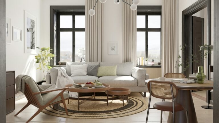
- Go bigger than you think. As a rule of thumb, art above a piece of furniture (like a sofa or console) should be around two-thirds the width of that furniture.
- Group smaller pieces together to create one larger visual unit. A gallery wall of 3–5 pieces can often have more impact than one small piece alone.
- Use painter’s tape to map it out first. This helps you visualise scale without committing to a nail in the wall.
Even if the art itself is small, reframing it with a generous mat and large frame can make it feel more intentional and better scaled.
Mistake #2: Hanging Art Too High
You’ve measured, stepped back, and nailed it in. But once it’s up, the art feels like it’s floating way above everything else — disconnected and awkward. That’s because it probably is.
Why it doesn’t work
When artwork is hung too high, it feels like it’s drifting away from the rest of the room. It loses connection with your furniture, your eyeline, and the rest of your design. Instead of creating flow, it creates visual tension.
How to fix it instantly
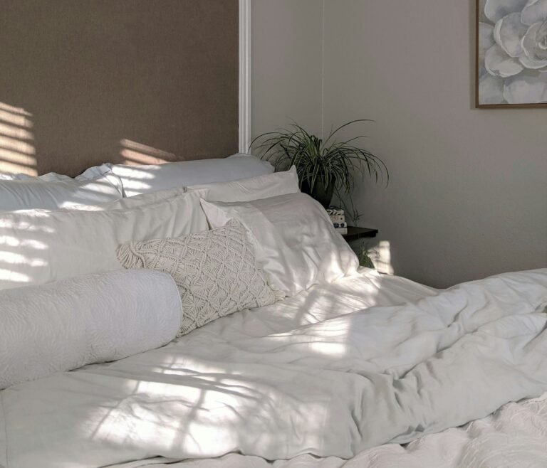
- Stick to eye level: The centre of your artwork should sit around 145–155cm from the floor — roughly average eye level.
- Anchor it to furniture: If you’re hanging art above a sofa, console, or headboard, leave 15–25cm of space between the top of the furniture and the bottom of the art. It should feel connected, not floating.
- Test before you commit: Again, painter’s tape is your best friend here. Map out where the piece will sit before hammering anything in.
Fixing this one mistake can completely shift how cohesive and grounded your room feels.
Mistake #3: Ignoring Wall Spacing and Proportions
You’ve got great pieces, but something still feels cramped — or oddly spaced out. That awkward vibe often comes down to spacing.
Why it doesn’t work
Even the most beautiful artwork can look wrong if it’s spaced poorly. When items are too close together, it feels cluttered. Too far apart, and it feels disjointed. Poor spacing breaks the flow and makes your wall feel more like a jigsaw than a design choice.
How to fix it instantly
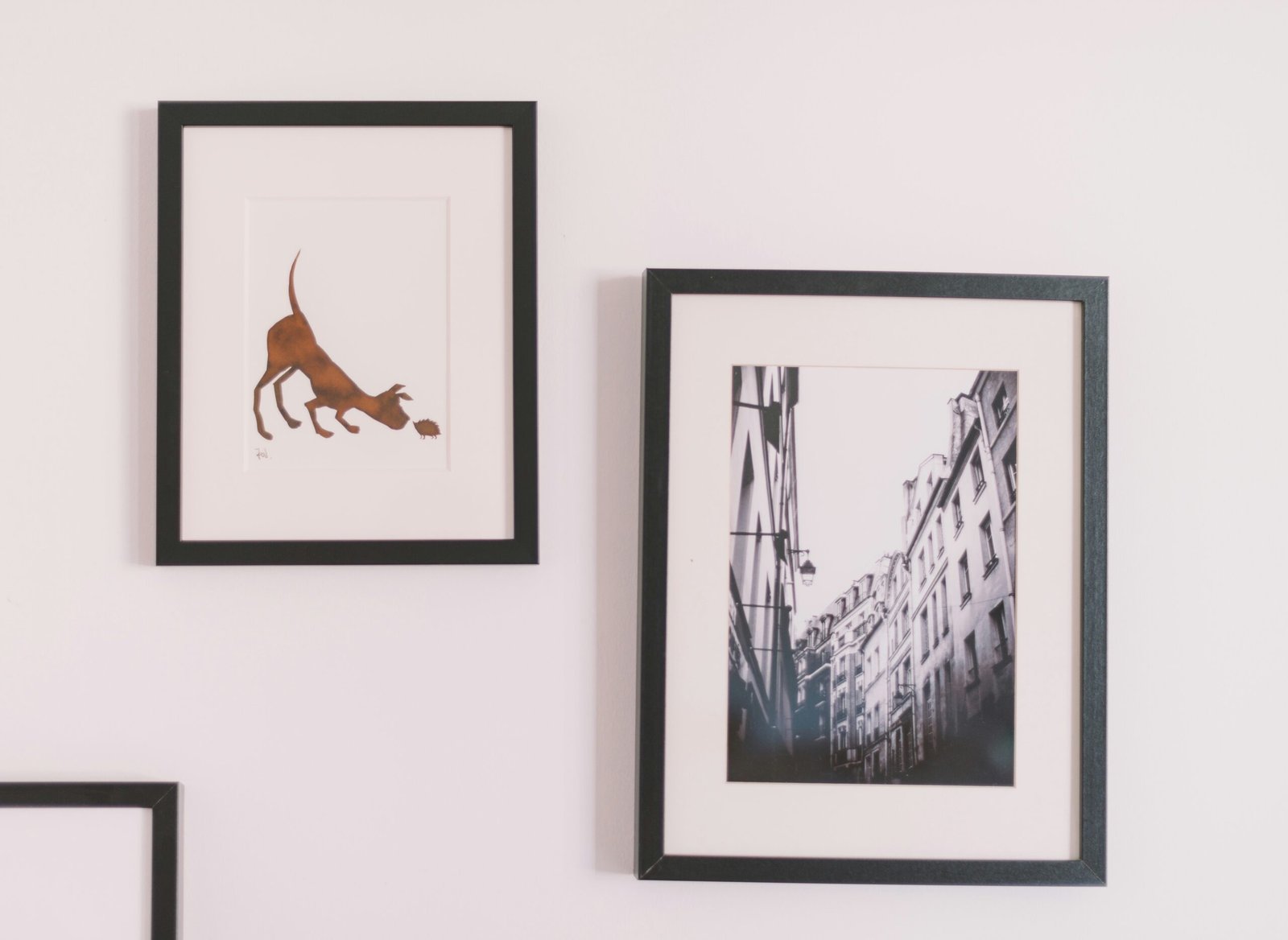
- Give your art room to breathe: Leave at least 5–8cm between frames in a gallery wall to avoid crowding.
- Think in blocks: Group items visually as a single unit. Centre that unit within the space rather than focusing on each piece individually.
- Respect the wall’s shape: Tall, narrow walls suit vertical arrangements. Wide walls suit horizontal ones. Don’t fight the shape — work with it.
Proper spacing is like white space in design — it helps your decor feel intentional, not accidental.
Mistake #4: One Lonely Piece on a Big Wall
You found a piece you love, centred it on a huge wall… and now it looks like a dot in a sea of emptiness. This is one of the most common (and frustrating) decor missteps.
Why it doesn’t work
Large walls need visual weight. A single small or medium piece, even if it’s beautiful, can feel lost and underwhelming. It draws attention to the empty space around it, making the wall feel unfinished.
How to fix it instantly
- Scale up: Opt for a larger piece — or better yet, a diptych or triptych that fills more of the space.
- Add companions: Pair your main piece with smaller ones to create a balanced arrangement. Think shelves, sconces, or a mirror to round it out.
- Use vertical or horizontal stacking: Two or three similar frames stacked neatly can give the wall presence without overcomplicating it.
A single piece can absolutely work — but it needs to be the right size, or styled with intention.
Mistake #5: Frames and Styles That Clash
You’ve collected prints, photos, maybe a canvas or two — but when they’re all up, it feels messy instead of curated. The issue? Your frames and styles aren’t playing nicely together.
Why it doesn’t work
Mismatched frames or clashing art styles can make a wall feel chaotic. Too many colours, materials, or visual themes competing for attention creates confusion, not cohesion.
How to fix it instantly
- Pick a theme: That doesn’t mean everything has to match, but it should relate. Use one unifying element — like a consistent frame colour, mat style, or colour palette in the art.
- Limit the frame finishes: Stick to 2–3 finishes across a wall (e.g. black, oak, and brass). That variety feels intentional without being overwhelming.
- Keep the vibe consistent: Don’t mix hyper-minimalist abstract art with ornate vintage paintings unless you really know what you’re doing. Choose pieces that share a tone, mood, or subject matter.
Cohesion is what turns random pieces into a gallery wall that looks effortlessly styled.
Mistake #6: No Visual Cohesion — Just a Random Collection
You’ve got a wall full of art, photos, maybe even a quote print or two — but instead of looking like a stylish gallery wall, it feels like a jumble sale of ideas.
Why it doesn’t work
When there’s no clear visual thread tying your wall decor together, it doesn’t feel curated — it feels accidental. Even if each piece is beautiful on its own, the wall as a whole lacks impact.
How to fix it instantly
- Choose a unifying element: This could be a consistent colour palette, a shared subject matter (e.g. all botanical prints), or a similar art style (e.g. line drawings, black and white photography).
- Lay it out before hanging: Arrange your pieces on the floor first. Move things around until it feels balanced and cohesive, then transfer that layout to the wall.
- Think of your wall as a story: Everything doesn’t have to match — but it should belong. Each piece should contribute to an overall mood or message.
Visual cohesion doesn’t mean being matchy-matchy — it means every piece has a purpose in the overall look.
Mistake #7: Neglecting Symmetry and Balance
You’ve hung everything with care — but something still feels off. The left side looks heavier than the right, or the top feels more crowded than the bottom. That’s a balance issue, and it’s more common than you’d think.
Why it doesn’t work
Our eyes are naturally drawn to symmetry and balance. When a wall feels lopsided — even subtly — it can make the entire room feel unsettled or visually noisy.
How to fix it instantly
- Use symmetry to your advantage: For a clean, classic look, arrange pieces in mirrored layouts or centred groupings.
- Balance doesn’t always mean matching: You can balance a large, bold piece on one side with several smaller ones on the other — as long as the overall visual weight feels even.
- Step back and squint: It sounds odd, but squinting at your wall blurs the details and helps you see the overall shape and balance of your layout.
Even in asymmetrical designs, a sense of harmony makes everything feel intentional and put together.
Mistake #8: Overloading the Wall
More isn’t always better. You kept adding pieces — a photo here, a print there — until suddenly your wall feels chaotic and overcrowded.
Why it doesn’t work
When a wall is overloaded with decor, nothing stands out. It overwhelms the eye and makes the space feel smaller, busier, and less restful. It’s the visual equivalent of shouting.
How to fix it instantly
- Edit ruthlessly: Take everything down and only put back what adds real value to the overall look. Ask yourself: Does this piece earn its place?
- Add breathing room: Negative space is powerful. It gives your pieces space to shine and makes your wall feel more considered.
- Create focal points: Choose 1–2 “hero” pieces to anchor your wall, and build around them with restraint.
Sometimes, the most stylish walls are the ones with the fewest pieces — placed with intention.
Mistake #9: No Layering or Texture
Your wall is decorated, but it still feels flat or sterile. Everything is behind glass, in frames, and arranged neatly — yet somehow, the whole thing lacks depth.
Why it doesn’t work
When every element on a wall is the same texture, height, and material, it starts to feel lifeless. A wall with no contrast or layering looks more like a catalogue page than a lived-in space.
How to fix it instantly
- Mix materials: Combine framed prints with things like woven baskets, mirrors, textiles, or even 3D objects like hats or small shelves.
- Add dimension: Not everything needs to be flat against the wall. Floating shelves, hanging planters, or layered frames can break up the monotony.
- Play with contrast: Combine soft and hard textures, shiny and matte finishes, light and dark tones — this adds richness and interest.
Layering adds warmth and makes a wall feel more like a reflection of you, not just a design formula.
Mistake #10: Forgetting About Scale Relative to Furniture
You hang something above your sofa, bed, or sideboard — but instead of tying the room together, it looks like it’s floating in isolation. The problem? You didn’t take the furniture into account.
Why it doesn’t work
Wall decor doesn’t exist in a vacuum. When it’s not scaled to the furniture below it, it can feel out of place — either too small to anchor the space, or so big it overwhelms it.
How to fix it instantly
- Follow the two-thirds rule: Art above a sofa, bed, or console should be about two-thirds the width of the furniture. This creates balance without overpowering.
- Mind the gaps: Leave 15–25cm between the top of the furniture and the bottom of the art — close enough to feel connected, not drifting.
- Think as a unit: The furniture and wall decor should feel like one composed area. Treat them like a single visual block, not separate items.
When scale is right, your decor feels natural and intentional — like it belongs, not like it was added after the fact.
Final Tips: Quick Rules for Wall Decor That Just Works
If you’ve been second-guessing your wall decor, here’s the good news: you don’t need a design degree or a complete overhaul to fix it. Just keep these simple rules in your back pocket:
- Bigger is usually better – Don’t be afraid to scale up.
- Keep the centre at eye level – Around 145–155cm from the floor.
- Balance is key – Symmetry is helpful, but balance matters more.
- Group intentionally – Treat grouped pieces as one unit, not random items.
- Use space wisely – Let your wall — and your art — breathe.
- Think beyond the frame – Add texture, depth, and personality.
Sometimes all it takes is shifting one frame down, adding a mirror, or removing that extra print to make your space feel instantly more pulled together.
One final thought…
Don’t overthink it. Your home should reflect you — not a rulebook. Use these tips as tools, not restrictions. If it feels right and brings you joy when you walk into the room, you’re doing it right.
Alex is the creator of Homely Haven, a space dedicated to simple, stylish ideas for interiors and gardens alike. With a passion for cozy living rooms, inviting outdoor spaces, and practical DIY solutions, Alex shares tips and guides that help turn any house into a true home.
From budget-friendly decorating hacks to weekend garden projects, the goal is always the same: to inspire you to create spaces that feel personal, beautiful, and welcoming. When not writing, Alex is usually rearranging furniture, sketching new garden layouts, or exploring design trends for the next project.