Color is one of the most powerful tools in home design. It influences mood, enhances space, and reflects personality. But how do you choose the perfect color palette for your home? By understanding the psychology of color, you can create spaces that not only look stunning but also evoke the right emotions for each room.
Whether you’re decorating a cozy bedroom, a productive office, or a welcoming living room, this guide will help you select colors that enhance both aesthetics and ambiance.
Understanding Color Psychology
Color psychology is the study of how colors affect human emotions and behaviors. Different shades can evoke various feelings—some colors energize, while others calm. Choosing the right colors for your home can transform how you feel in each space.
Basic Color Emotions:
- Warm Colors (Red, Orange, Yellow): Stimulating, energetic, and inviting.
- Cool Colors (Blue, Green, Purple): Calming, relaxing, and refreshing.
- Neutral Colors (White, Gray, Beige, Brown): Balanced, timeless, and versatile.
💡 Pro Tip: Think about how you want to feel in each room before selecting a color palette!
Choosing the Right Colors for Each Room
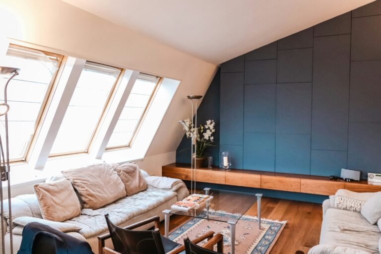
Living Room: Warm & Inviting
The living room is often the heart of the home—a space for gathering, entertaining, and relaxing. Choosing colors that encourage warmth and connection, such as soft neutrals, warm earth tones, or inviting shades of blue and green, can enhance the ambiance. Incorporating cozy textures, layered lighting, and personal touches will further create a welcoming and stylish atmosphere for family and guests alike.
Best Colors for Living Rooms:
- Warm Neutrals (Beige, Greige, Soft White): Timeless and versatile, these shades create a cozy backdrop.
- Earthy Greens & Blues: Soothing and organic, they bring a sense of calm and sophistication.
- Rich Jewel Tones (Emerald, Navy, Burgundy): Add drama and elegance without overwhelming the space.
💡 Pro Tip: Pair neutral walls with colorful accents like throw pillows and artwork for a balanced look!
Bedroom: Relaxing & Serene
Your bedroom should be a sanctuary—a place for rest and relaxation, where you can unwind at the end of the day. Soft, muted tones like calming blues, warm neutrals, or gentle pastels work best to create a peaceful atmosphere. Layering cozy textiles, incorporating soft lighting, and keeping clutter to a minimum can further enhance the soothing and restful vibe.
Best Colors for Bedrooms:
- Soft Blues & Greens: These cool shades promote tranquility and restful sleep.
- Lavender & Mauve: Subtle purple hues add a dreamy, soothing effect.
- Warm Neutrals (Cream, Taupe, Dusty Pink): Cozy and inviting, these colors make a bedroom feel like a retreat.
💡 Pro Tip: Avoid bright reds and yellows in bedrooms, as they can be too stimulating for sleep.
Kitchen: Energizing & Welcoming
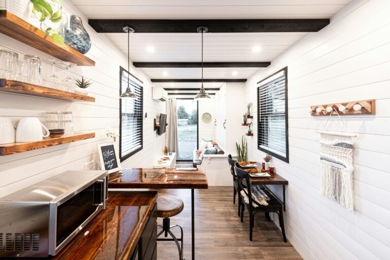
Kitchens are lively spaces where families gather and creativity flows, making color choice essential for setting the right mood. Opt for fresh and energizing shades like crisp whites, soft greens, or warm yellows to create an inviting and inspiring atmosphere. Incorporating natural materials, good lighting, and thoughtful accents can further enhance the warmth and functionality of the space.
Best Colors for Kitchens:
- Soft Whites & Warm Grays: Classic and bright, they make kitchens feel open and airy.
- Muted Greens & Sage: These earthy hues bring a sense of freshness and connection to nature.
- Deep Blues & Navy: Adds a sophisticated contrast to cabinets and walls.
💡 Pro Tip: If you have a small kitchen, opt for lighter colors to create a more open feel!
Bathroom: Refreshing & Spa-Like
Bathrooms should evoke cleanliness and relaxation, making color selection key to achieving a serene atmosphere. Soft, airy colors like crisp whites, gentle blues, and soothing pastels work best to create a spa-like ambiance. Incorporating natural textures, plush towels, and warm lighting can further enhance the feeling of tranquility and luxury.
Best Colors for Bathrooms:
- Crisp White & Soft Gray: Classic and timeless, making small bathrooms appear larger.
- Light Blues & Aquas: Refreshing and calming, perfect for a soothing bath.
- Earthy Greens & Sand Tones: Natural and organic, ideal for a zen-like retreat.
💡 Pro Tip: Add touches of luxury with metallic fixtures in gold or brushed nickel!
Home Office: Productive & Focused
Your workspace should encourage concentration and creativity, making color choice an important factor in setting the right tone. Shades like soft blues and greens promote focus and calmness, while energizing tones like muted yellows or warm neutrals can boost productivity and motivation. Pairing these colors with good lighting, ergonomic furniture, and minimal distractions will help create an inspiring and efficient work environment.
Best Colors for Home Offices:
- Soft Blues & Cool Grays: Enhances focus and reduces stress.
- Deep Greens & Navy: Promotes concentration and a sense of stability.
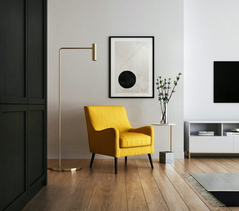
- Warm Yellows & Burnt Orange: Adds energy and creativity to the space.
💡 Pro Tip: Avoid using too many dark colors in a small office, as they can make the space feel cramped.
The 60-30-10 Rule for a Balanced Color Scheme
A well-designed space follows the 60-30-10 rule, a timeless guideline that helps balance colors in a visually appealing way. This rule suggests using 60% of a dominant color for the main backdrop, 30% of a secondary color for contrast, and 10% of an accent color to add personality and interest. Applying this approach ensures harmony and depth in any room, creating a cohesive and well-thought-out design.
How It Works:
- 60% – Dominant Color: The main color used in walls, large furniture, or flooring.
- 30% – Secondary Color: A complementary shade found in furniture, curtains, or rugs.
- 10% – Accent Color: A bold pop of color in pillows, artwork, or small décor.
💡 Pro Tip: Stick to this rule when designing any room to create harmony and balance!
How Lighting Affects Color Perception
Lighting plays a crucial role in how colors appear, affecting their warmth, depth, and overall impact. A color that looks perfect in a store may appear completely different in your home due to variations in natural and artificial lighting. To avoid surprises, test paint swatches at different times of the day and under various light sources to ensure the color complements your space perfectly.
Lighting & Color Guide:
- Natural Light: Brings out the truest version of a color.
- Warm Artificial Light (Yellow Bulbs): Enhances warm tones but may dull cool shades.
- Cool Artificial Light (LED & Fluorescent): Boosts blues and greens but can make warm colors feel washed out.
💡 Pro Tip: Test paint samples on different walls and check them at various times of the day before committing!
The Power of Accent Walls
If you’re not ready to paint an entire room, an accent wall can add a stylish pop of color without overwhelming the space. It creates a focal point, adding depth and personality while keeping the overall design balanced. Whether you choose a bold hue, a textured wallpaper, or a mural, an accent wall is an easy and impactful way to refresh your space.
Best Places for Accent Walls:
- Behind the bed in a bedroom.
- As a statement wall in the living room.
- In the dining area to add character.
💡 Pro Tip: Use textured wallpaper, wood panels, or a bold paint color to make the accent wall stand out!
The Psychology of Color Combinations
Pairing colors effectively is just as important as choosing individual shades, as the right combinations can enhance the mood and cohesion of a space. Complementary colors create bold contrast, while analogous colors offer a harmonious and soothing effect. Using a balanced mix of neutrals and accent shades ensures a visually appealing design that feels both intentional and inviting.
Winning Color Combinations:
- Navy + White + Gold: Classic, timeless, and sophisticated.
- Soft Gray + Blush Pink + White: Elegant, airy, and feminine.
- Sage Green + Cream + Wood Tones: Earthy, natural, and calming.
- Black + Deep Green + Brass: Dramatic, moody, and luxurious.
💡 Pro Tip: Use a color wheel to find complementary and harmonious color pairings!
Final Thoughts: Designing with Color Confidence
Choosing the perfect color palette for your home is more than just an aesthetic decision—it’s about creating spaces that feel right for you. By understanding color psychology and using smart design principles, you can craft a home that enhances mood, function, and beauty.
So, whether you’re drawn to calming blues, energizing yellows, or timeless neutrals, remember: your home should reflect your personality and lifestyle.